Invent Documentation
Education Events Theme Crafted with ♥ by LiveMesh
Multi-Purpose, flexible and responsive WordPress theme serving Educational Institutions like School/Colleges, Design Agencies, Artists, Corporates, Small Businesses, Product developers and many more.
Thank you for purchasing our theme. If you have any questions that are beyond the scope of this help file, please open a support ticket in the forum or email me from the bottom right box here. Thanks so much!
| Author: | LiveMesh |
| Contact: | Profile Page |
| Author URL: | ThemeForest Profile |
| Item URL: | Theme Demo |
| Current Version: | 3.0 |
| Documentation Version | 1.2.0 |
| Created: | 2014-10-24 |
| Modified: | 2016-02-16 |
Installation and Theme Setup
- Download and unzip theme package file. The following folders will be in the unzipped file:
- invent - theme files that you need upload to your wordpress installation.
- licensing - license for the theme.
- documentation - documentation files for the theme.
- Have WordPress installed on your site. If you need help installing Wordpress see the link below to know more about: http://codex.wordpress.org/Installing_WordPress
- Before you install the theme, make sure your wordpress version is 4.1 or higher. Then upload only the folder "invent" to the /wp-content/themes folder of your WordPress installation root directory or ftp the folder to /wp-content/themes/ through your FTP Client.
- Next login to your WordPress admin panel and go to Appearance -> Themes subpanel. Then look for Invent theme and activate it just like you would activate any other theme.
- Once activated Invent, you will see the new panels below added to the Administration Panels.

Importing Theme Data
It's not so difficult to use our theme to build your website. Actually to make it easy for you to build your website, we have uploaded the content xml file and the download link is available in the README.txt in the root folder, so that you can import lots of ready content to your installation. Once you have activated the theme, all you need to do is to import the contents using Wordpress importer plugin.
If you want to know how to import the contents from xml file please see this video tutorial on how to import a WordPress XML file Of Posts and Pages
Once you are done importing the content, Please explore the "Pages", "Posts" etc on the admin panel and edit them as per your requirement. Please read this documentation for any assistance on the theme, and also we will be happy to assist you in all possible manner.
Invent comes with three responsive Slider options including the premium Revolution Slider for building a rich home pages for your website. The Revolution Slider is bundled with the theme and comes with its own documentation. Do refer to the same for help with Revolution slider. Do check our Invent live preview website for many different types of home page formats that are available for use by the users.
To know more about how to add sliders to a page, go the section How to Add Slides for Sliders
Site Configuration
If you import the sample data, all the required pages including home pages, page sections part of these pages, portfolio entries are all created for you. If you need to know about how the initial site configuration works with Invent, this section can help you. Some of these steps are covered in the video tutorial.
Invent can function as a multi-page or as a single page or as popularly known, an one page theme. Invent recommends using SiteOrigin page builder to help building a site of either type easier.
Step 1: Invent recommends installing the following plugins for page building. The theme prompts the users to install the below plugins automatically upon activation. Just follow the prompts at the top to install the below plugins.
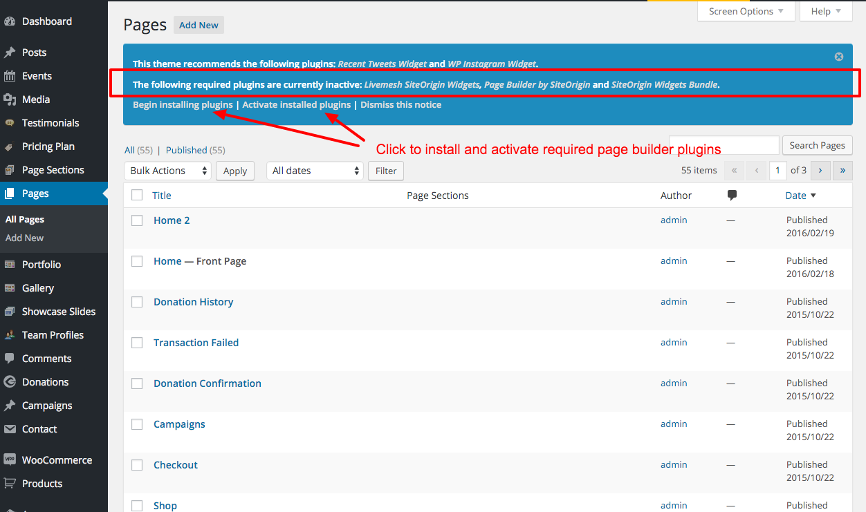
SiteOrigin Page Builder - is the most intuitive, lightweight yet feature-rich WordPress page builder around that lets you compose your page using page builder elements/widgets. The theme comes preloaded with about 30 page builder elements and additional 15 elements are provided via our LiveMesh SiteOrigin widgets plugin linked below.
SiteOrigin Widgets Bundle - that lets you develop widgets or page builder elements and comes with about 10 highly configurable page builder widgets of its own.
Livemesh SiteOrigin Widgets - is a free yet well supported plugin on wordpress.org, developed and maintained by the author of this theme. This plugin adds about 15 premium quality widgets to the SiteOrigin page builder. This is in addition to about 30 page builder elements provided by the theme itself.
If you use the widgets from Livemesh SiteOrigin Widgets plugin and need support, feel free to get in touch with us in our support forum. You can see all the widgets in action at the plugin live demo site.
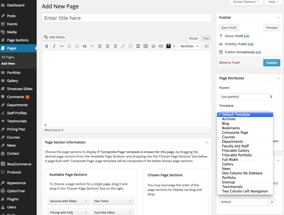
Step 2: Once activated, you can use page template One Column No Sidebars to design your home page and additional pages for your site. Refer to the documentation for the respective plugins to know more about using the page builder and its widgets.
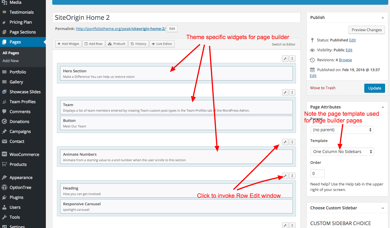
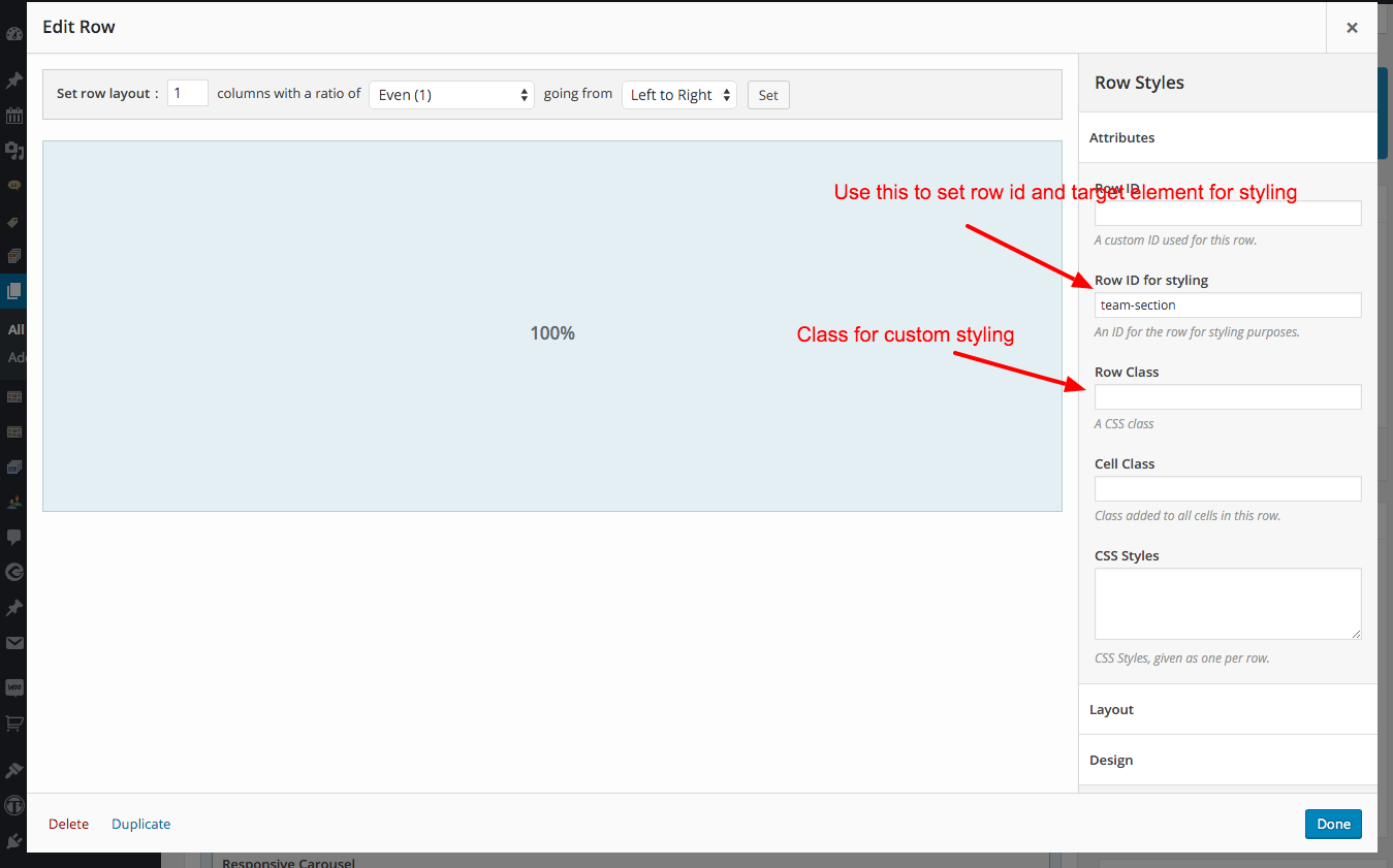
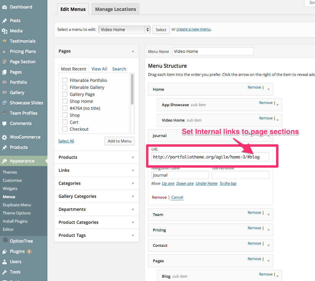
When you set Row ID, navigation menu on the top can house internal links to these page elements in the page builder helping to navigate within the page.

For more information on using the Page Builder by SiteOrigin, pls refer to the documentation
https://siteorigin.com/page-builder/documentation/.
https://siteorigin.com/widgets-bundle/
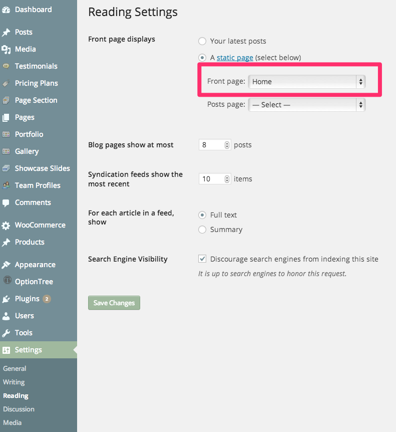
Step 3: Make this page the home page by choosing it as one in the 'Settings->Reading' tab. Pls have a look at the video tutorial if you not familiar with these functions or hit a roadblock somewhere.
Step 4: Use the WordPress menu to populate the top navigation menu in Appearance->Menus tab in the WordPress admin. Make sure you setup one of the menus as the primary menu for the site and also make sure setup all internal links to page sections inside a single page manually.
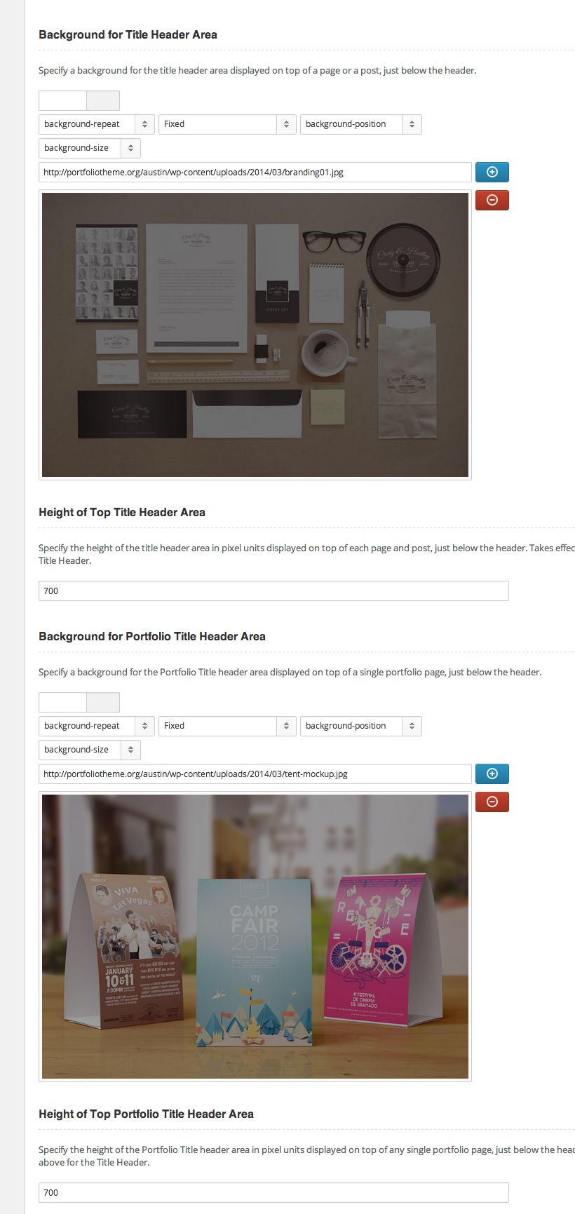
Step 5: To set custom background for all pages, navigate to Theme Options->Header tab and change the options for 'Background for Title Header Area' as seen the screenshot below. You can adjust the height of the background as well using the available options 'Height of Top Title Area'.
Once you have the page created and set as home page, page sections created and options set for which sections go into the one page home, just open the home page to verify that the page does contain the desired sections and the chosen navigation is displayed at the top of the page.
You now have a small working site setup now. With the help of page sections you can now continue developing your site in an incremental/iterative fashion.
Multiple Single Pages in a site
To create multiple single pages, you will need to create another page with the page template 'One Column No Sidebars' and then in the page edit window, use the SiteOrigin page builder to build the pages just as described above. This helps you to create multiple one page templates to showcase multiple products or multiple aspects of your business in a single wordpress installation.
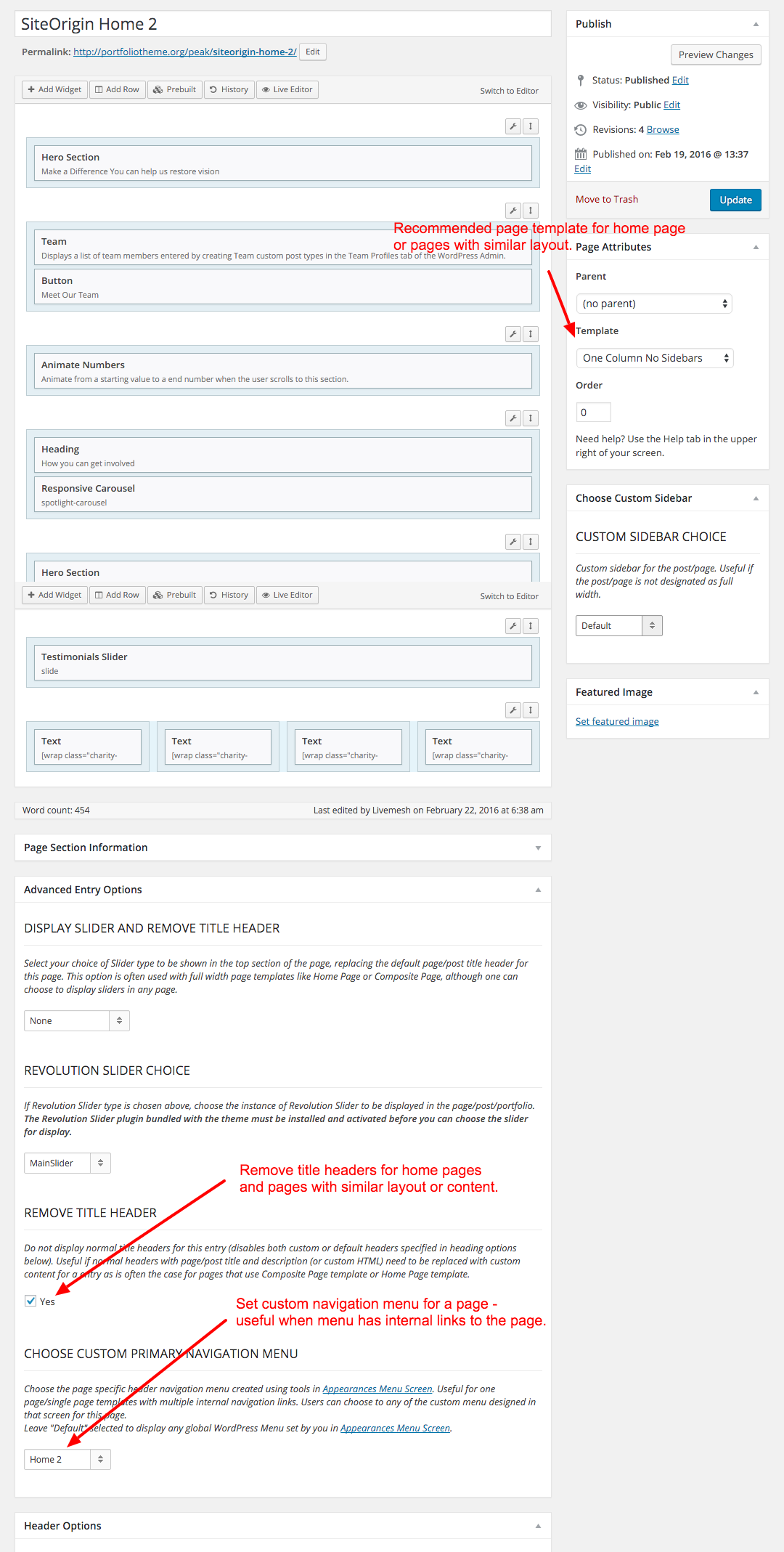
Since each of these sub-pages have page sections of their own, you can create a custom menu in the WordPress Appearances -> Menus window and configure a custom WP menu for a page. The theme provides a dropdown for choosing a custom menu in the page edit window (see bottom of the screenshot below).
In order to save time replicating some of the menu items in the primary menu in custom menu, you can use the Duplicate Menu plugin to duplicate the primary menu used for home page and then start customizing it to meet the needs of another One Page (Single Page) template page.
General Options
Once activated, Invent provides a number of options for customizing your site. The options panel is mostly self-explanatory with reasonable documentation on each and every option provided there. While not repeating the documentation already provided there, we will try to cover some of the less obvious details here in this document. Let us look at the General tab of Invent Options.
Slider Choice - Invent comes with three responsive Slider options including the premium Revolution Slider for building a rich home pages for your website. The Revolution Slider is bundled with the theme and comes with its own documentation. Do refer to the same for help with Revolution slider. Do check our Invent live preview website for many different types of home page formats that are available for use by the users.
To know more about how to add sliders to a page, go the section How to Add Slides for Sliders
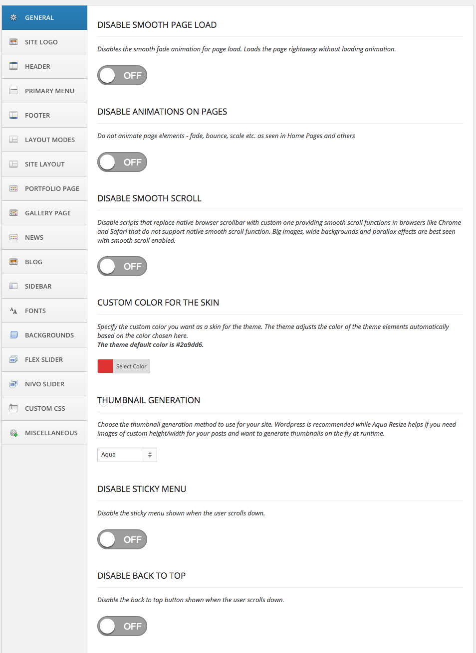
Thumbnail Generation - Invent provides option to the user to use either Aqua or WordPress native thumbnail generation method.
Aqua - While Aqua is more flexible and is needed when you want to create images of custom height and width on the fly (as and when the web request comes in), you may be unneccessarily cropping images if WordPress has already generated them when the images are uploaded to the server, although in many cases Aqua actually does check for existing thumbnails before trying to crop and create new thumbnails.WordPress - WordPress thumbnail generation of various sizes occurs right when you upload the image to WordPress (when adding to a post or page, for example or when you add a new item under Media subpanel in the admin screen). If you enable Invent on an existing website with images already uploaded, use Regenerate Thumbnails WordPress Plugin to generate thumbnails for images already uploaded to the WordPress site. This will help generate images of sizes required by Invent for its blog, portfolio pages/posts of various configurations. Invent tries to keep the number of image sizes generated to minimal number with additional sizes achieved through CSS re-sizing on the generated files when quality is not compromised by such resizing.
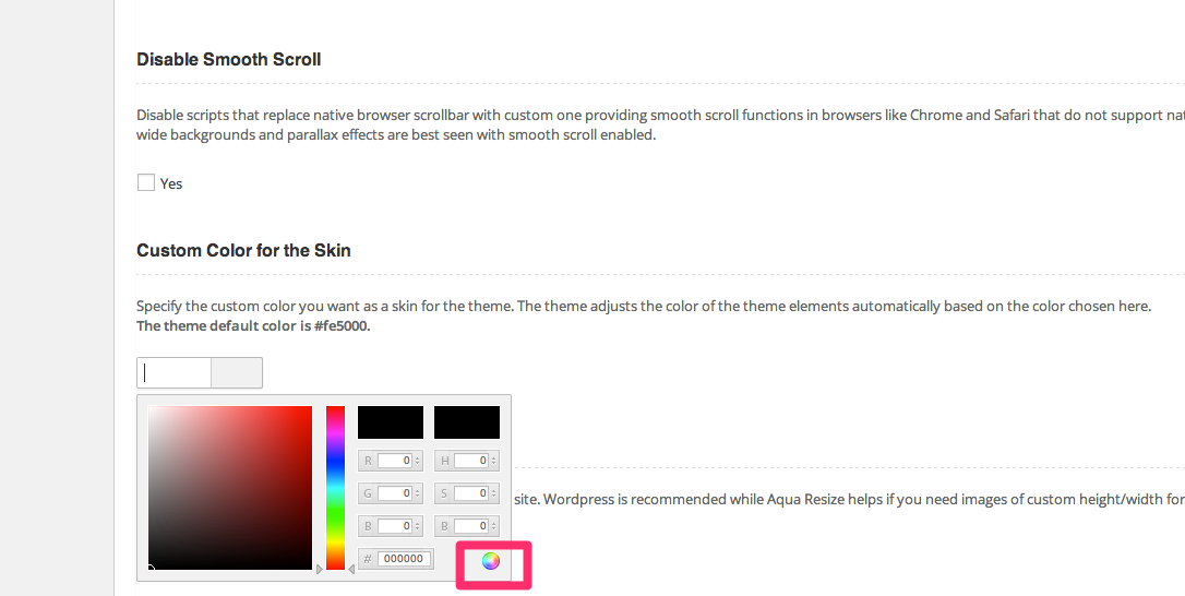
The theme comes with Unlimited Colors/Skins option. To change the theme skin, just enter a custom color value for the option 'Custom Color for the Skin' in the General tab of theme options.
Logo and Header Options with Social Icons
Invent Logo Options Panel allows the user to upload logo image. Option to forego image logo and go for text also is provided.
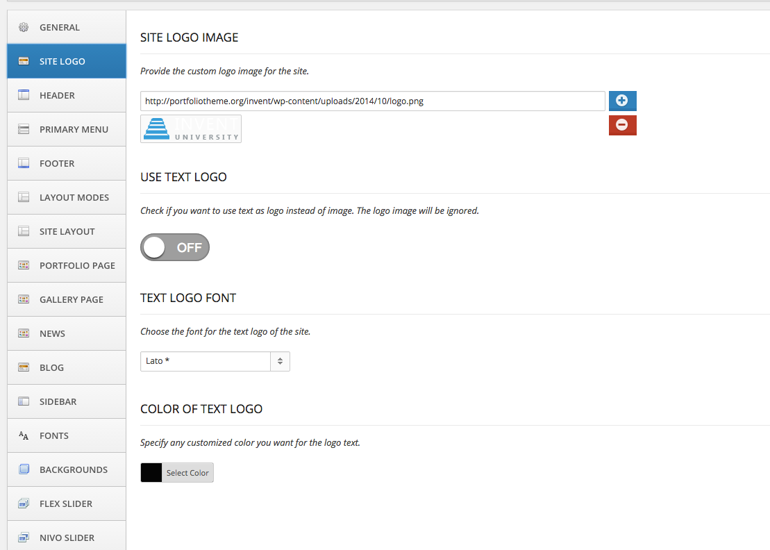
Invent Header Options Panel allows the user to manage the top header area of a page. Navigation menus can be enabled through standard WordPress Admin panel for under Appearance->Menus tab.
Tagline for Blog Post - For blog post, specify the text to display in this area. 'Blog' is the default. Unlike blog posts, the tagline area of a page displays the page title. Remove tagline from Home Page - Remove tagline displayed on top of the home page (the default WordPress blog view shown when no static page is specified as home page).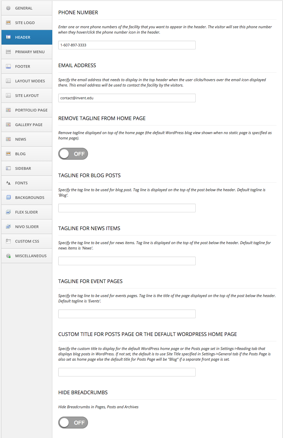
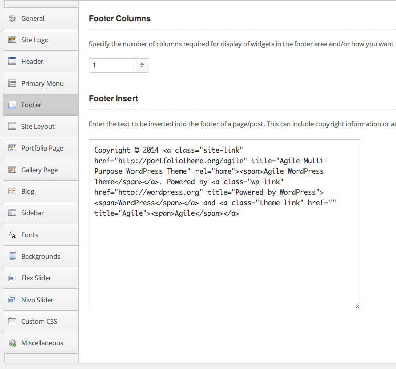
Footer area of Invent is quite flexible with many different options on number of widgets you can place and how you want them to be arranged. The Widget panel lists a total of six Footer areas to which you can drag and drop a WordPress native widgets as well as widgets provided by Invent.
Footer Columns - Along with providing simple option of having equal sized 2,3,4,5,6 columns, you also have options to specify how the footer widgets need to be arranged.Google Analytics Code - The Google Analytics option can be found in the Miscellaneous tab of the theme options panel.Invent is Google Analytics ready. To start tracking users, signup for Google analytics, obtain the tracking code and paste it into this text box to start tracking user activity for your website.
You can modify the copyright text shown in the footer of each page by providing the modified text in the header tab.
Layout Modes
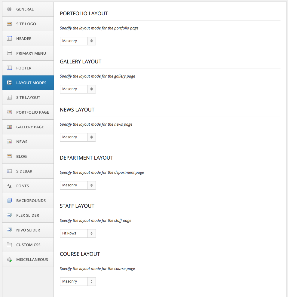
Invent supports masonry as well regular equal sized items grid (named Fit Rows) layout for most of the custom posts archive pages.
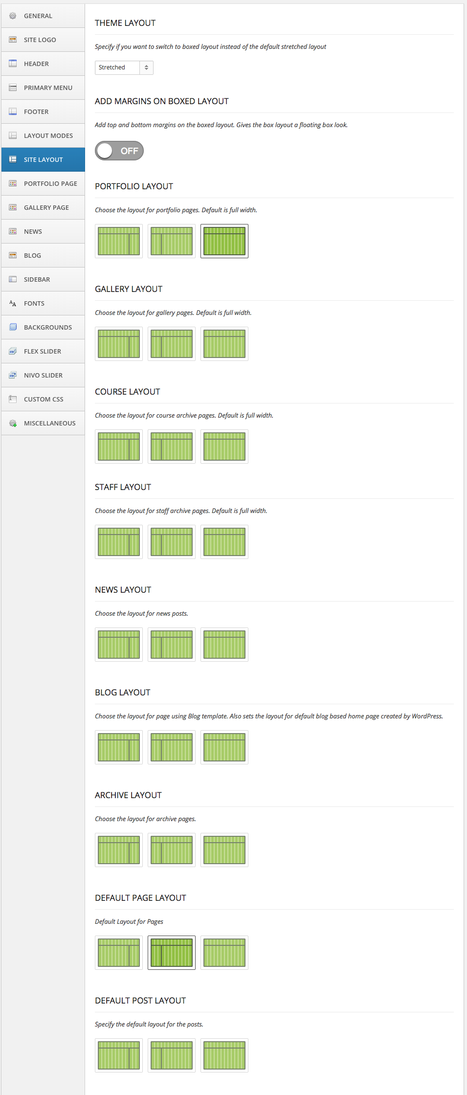
Site Layout Options
Invent supports single column and 2 column layouts for static pages, portfolio pages as well as blog posts. The options panel helps change the layouts for static pages, blog pages and archive pages like those of categories, tags or authors. The Invent Live Preview Site showcases many of these layouts and styling (see below) to help familiarize the user with them.
Fonts, Colors and Backgrounds Options
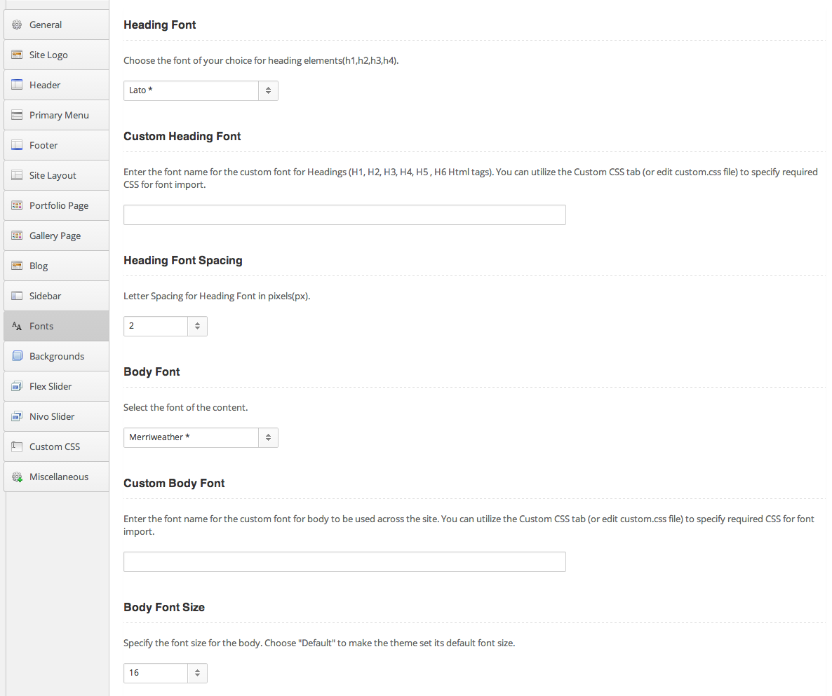
Invent provides options to change font family, font size and font spacing for your Headings and Body. More than 500 fonts are available for use. If you need additional fonts, you may import and use the same with the help of the Custom CSS panel in theme options. Do visit http://www.google.com/webfonts for instructions on adding additional fonts through css.
Do visit Install Custom Fonts support page for help in installation of custom fonts.
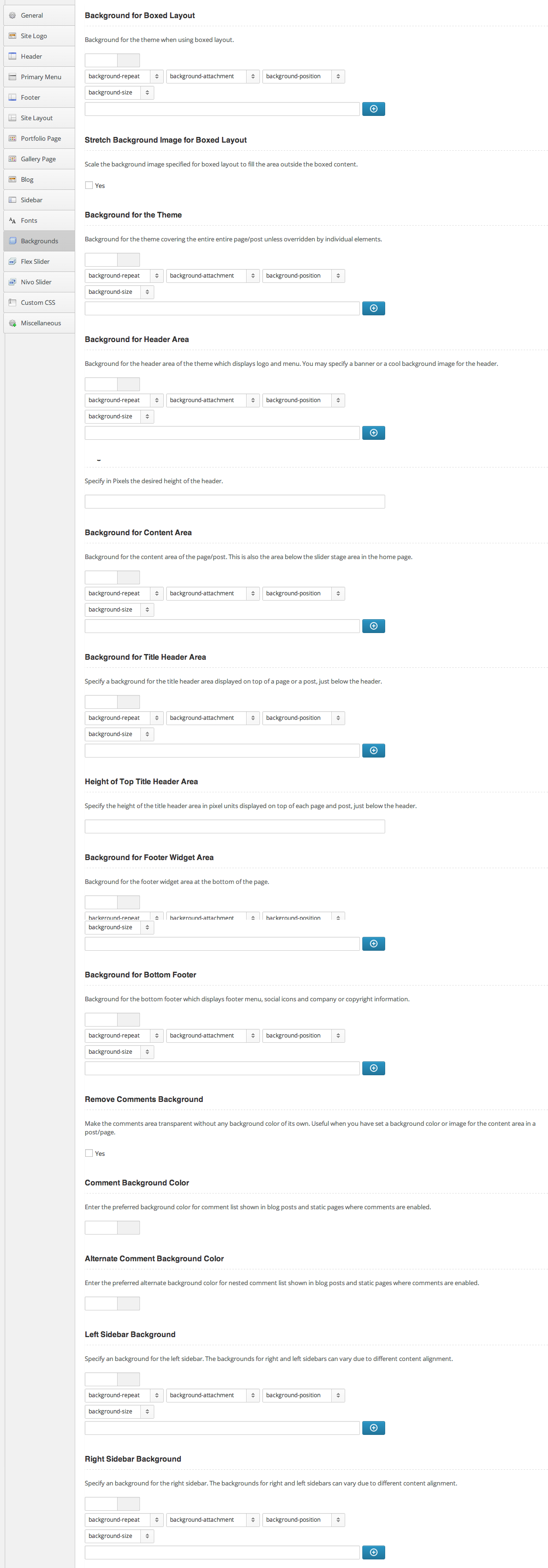
Invent comes with extraordinary amount of customizations for backgrounds. Most of these options helps build a custom website for yourself with your custom fonts, backgrounds, banners, icons etc.
The theme comes with Unlimited Colors/Skins option. To change the theme skin, just enter a custom color value for the option 'Custom Color for the Skin' in the General tab of theme options.
Choosing the right backgrounds for your site can greatly enhance its appeal. Almost any part of any Invent page can be customized for its background.
Choose boxed layout for that extra effect when setting custom backgrounds. Most of these are straightforward and online contextual help should explain the purpose of each customization.
Pls visit WordPress Menu User Guide to know more about how to add menus to WordPress site.
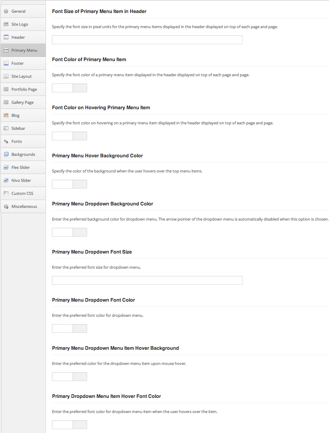
Below you can see options to customize the primary menu shown on the top header of any page -
Custom CSS
No matter how many font, color and backgrounds you have on the options panel, there is always some custom CSS code that you may like to see applied to achieve that perfect look. Use Custom CSS tab to override or extend every other option, including the styles defined by skins. This Custom CSS is handy when you can't find the option you want or just in a mood to write CSS code instead of choosing an option.

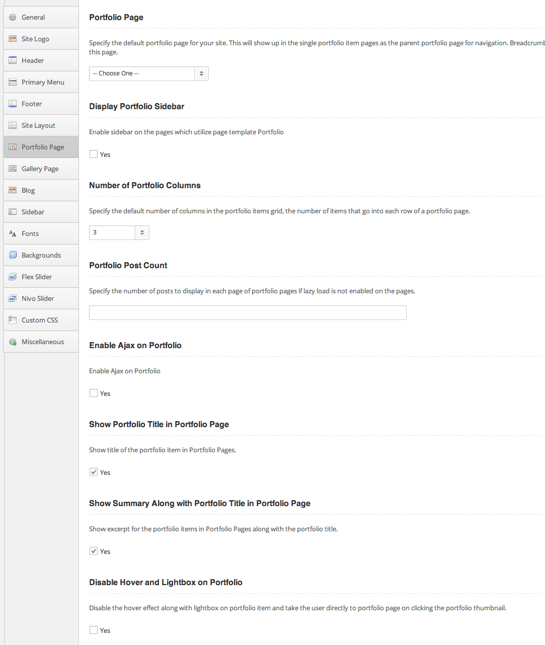
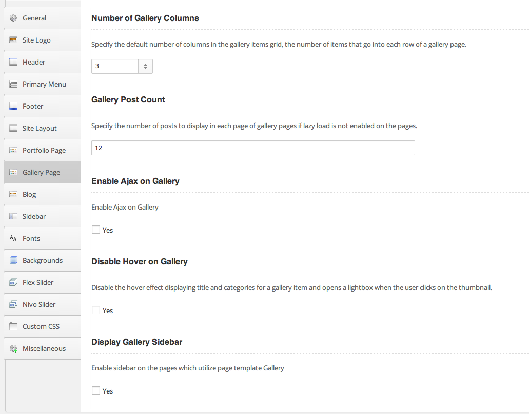
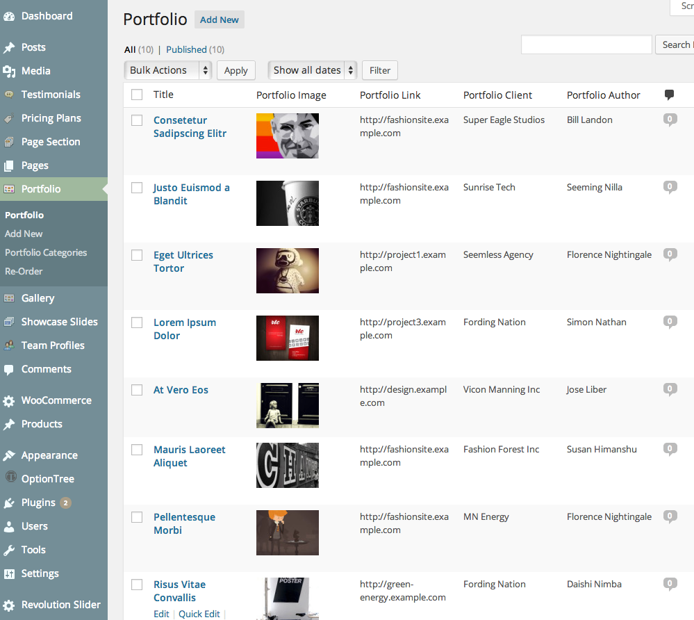
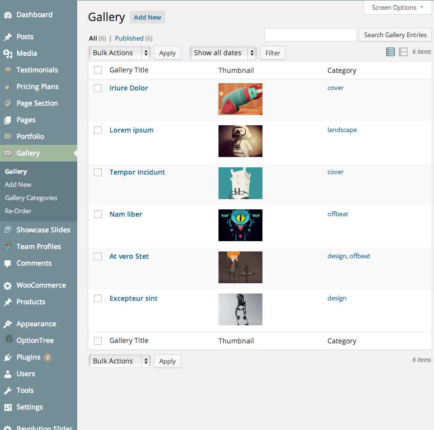
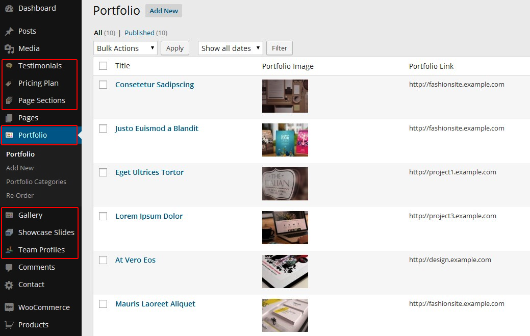
Portfolio and Gallery Page Options - How to make Portfolio and Gallery Entries
Invent provides several page templates for building your portfolio and gallery pages as shown below. Use these templates to customize your portfolio/gallery pages in the page edit window.
You can create portfolio pages by choosing to add Portfolio Custom Post Type in the Portfolio Admin Panel as shown below
The gallery creation is similar by choosing to add Gallery Custom Post Type in the Gallery Admin Panel as shown below
More precise instructions on portfolio entry below -
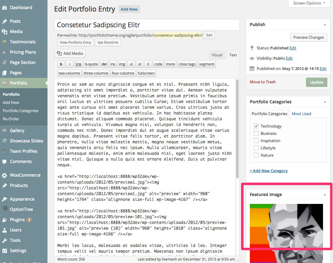
If you want to add a new portfolio item, follow the steps below:Click "Add New" in the "Portfolio" panel.
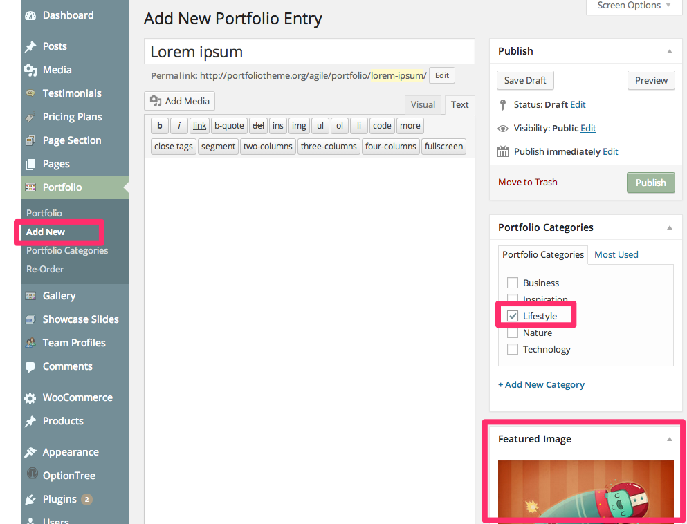
- Portfolio thumbnail is specified by Featured Image function of WordPress. Go here to see how to set a Featured Image for a post, page or a custom post type in WordPress.
- Then specify the title, and add content to the rich text editor. You can also provide excerpt through to the Excerpt textarea for display in the portfolio page.
- Once you have done, click Publish button.
Follow similar process for creating a gallery item as well. A gallery item will require only the title and the featured image to be entered along with the category.
How to Add Slides for Sliders
The Slider options panels for each of the slider types are self-explanatory. To display Nivo or Flex sliders, slider entries of custom post type named "Showcase Slides" that corresponds to a slider have to be created before Nivo or Flex Sliders can be displayed.
To create a page with sliders on the top, you just need to choose the desired options in the Page Edit window as seen below
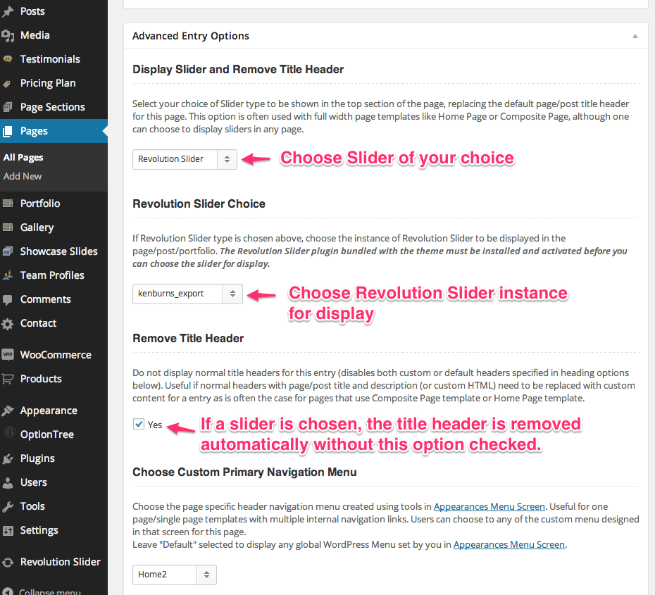
The specific slider to be displayed can be chosen in the "Display Slider and Remove Title Header" dropdown provided in the Page Edit window as seen in the below screenshot. The title header for the page is automatically disabled when a slider is chosen for a page.
Revolution Slider:
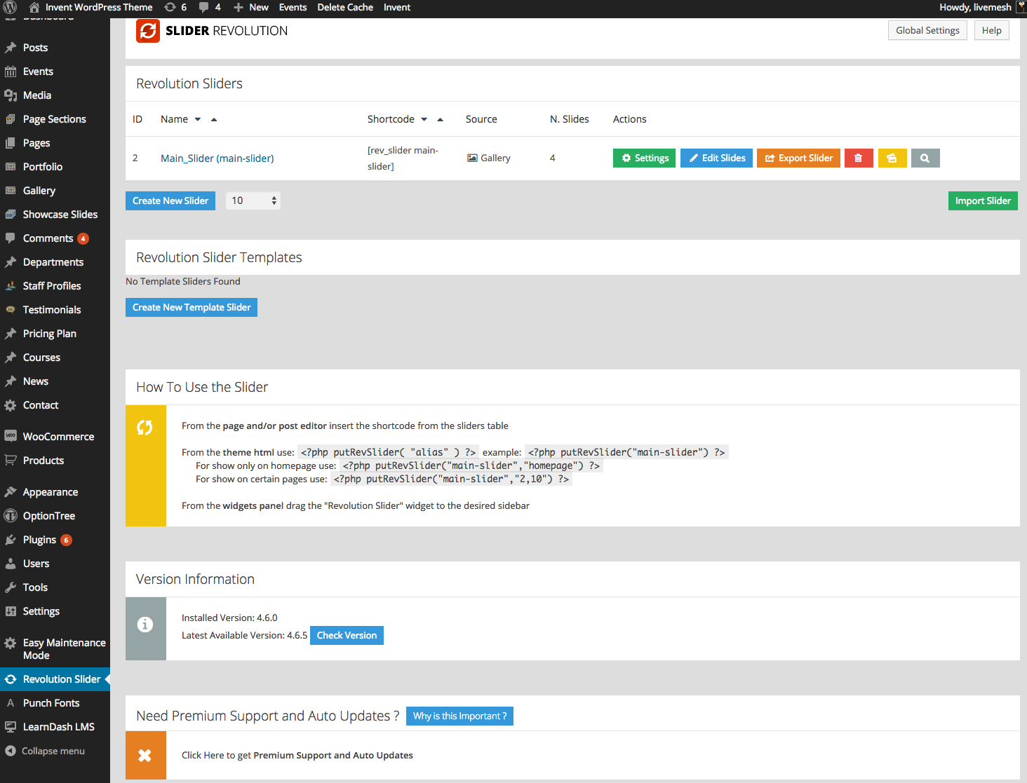
The Revolution Slider is installed as a plugin into WordPress. Pls read plugin install guide for instructions on how to install plugins into WordPress. The Revolution Slider is bundled with the theme as a separate zip file or can be installed by following the prompts displayed in the WordPress admin by the theme to install revolution slider plugin.
To display Revolution Slider on your site, follow the below steps -
- Create a new WordPress page and choose the Revolution Slider as the option
- Choose Revolution Slider as the option in the "Display Slider and Remove Title Header" dropdown provided in the Page Edit window as seen in the below screenshot.
- Choose specific instance of Revolution Slider as the option in the "Revolution Slider Choice" dropdown provided.
- You can browse through the Revolution Slider documentation on how to use the admin panel for the slider.
- The theme comes with import data for the Revolution Slider instance displayed in the live preview page.Do refer to the documentation for Revolution Slider for help on importing the data.
Nivo Slider, FlexSlider
The Nivo and Flex Sliders derive their slides from the Showcase Slide custom post types as shown below.
You will need to create posts of this custom post type in the Showcase Slides admin panel.
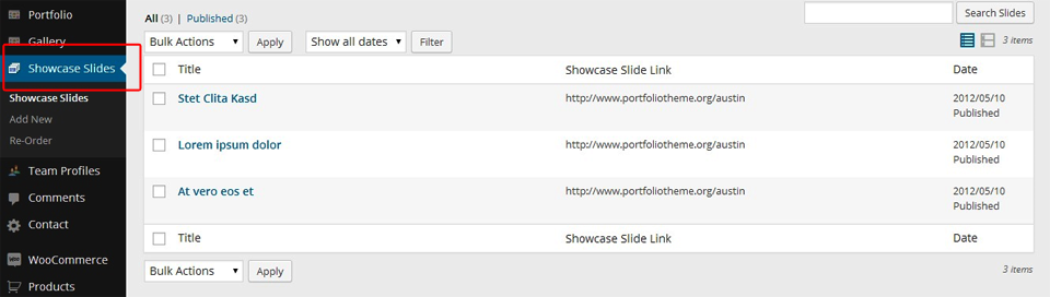
Click "Add New Slide" in the "Showcase Slides" admin panel.
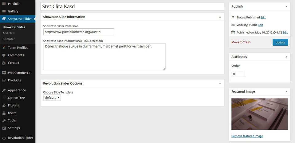
- Use the Featured Image function to set the image for the Slide of the Slider. The image size for Flex as well Nivo Slider should be minimum 1920px width and minimum 800px height so as to render the slider images right on wide screens. Be aware that the theme crops the images to height of 600px when the height is larger than that number. If you need a slider of larger and smaller height, you can opt to change the height in the options panel. For best results, keep the image size width the same for all images and height minimum of 600px. Click here to see how to set a Featured Image.
- Specify the link, description (Showcase Slider Information) , click Publish Button.
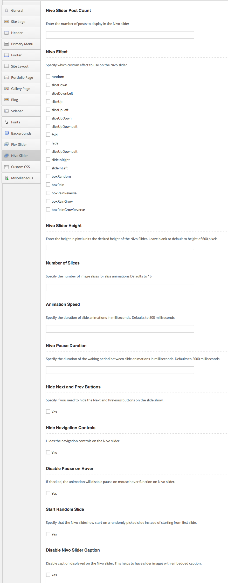
Below are the options provided for Flex Slider and Nivo sliders. Most of these options are documented in the admin panel itself.
Flex Slider Options
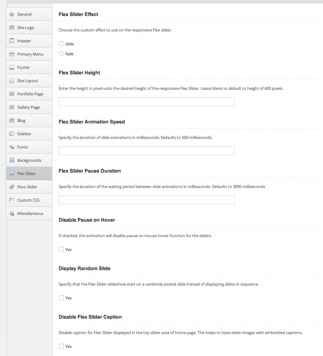
Nivo Slider Options
Set Featured Image
- Go to Add New or open an existing post in editing mode.
Find the Featured Image section and click the Set featured image link.
- You will see popup window for uploading an image for inserting into a blog post, page or custom post type or for using this image as featured image on the post, page or custom posts. Follow the on-screen prompts to choose the image from your computer (or better drag and drop the one or more images into the file uploader) and upload it or choose one one of the images already uploaded to your Media Library.
Once the image is uploaded, choose the size of the image, and click on the Use as featured link:
Close the Set Featured Image window once you’ve chosen the featured image. The image is now available for use wherever the post, portfolio item or slider slide is displayed as in a slider or portfolio page.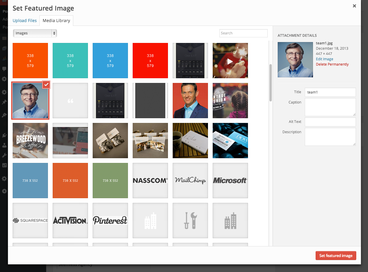
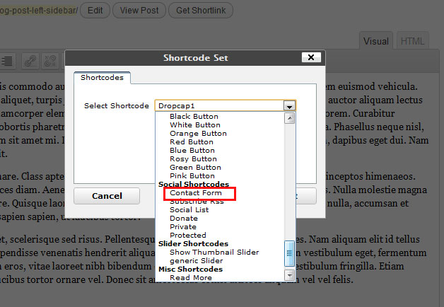
Shortcodes Builder
Invent comes with nearly innumerable custom shortcodes that can be used inside your post or page content. The Invent Live Preview site has many pages listed for demo of shortcodes with their corresponding code and is a good resource for familiarizing yourself with the the shortcodes provided by Invent. Check for the demo shortcode pages under 'Pages' dropdown menu.
You can easily use Shortcodes with the help of Shortcode Builder tool accessible from the WordPress post/page editor.

Fill in the required details of shortcode attributes on the shortcode entered.
Typography Shortcodes
The Segment shortcode -
Any full width or home page created in the Invent theme is divided into multiple segments. The sample data bundled with the theme has examples of many pages broken into multiple full width segments with the help of [segment] shortcode. The [segment] shortcode is used across all home pages and many other full width pages in Invent. The Invent theme provides unlimited flexibility when creating full width pages - pages that, by default, span the entire browser/screen width instead of being limited to a 960px or 1140px grid ( typical of any blog influenced WordPress template). The job of the [segment] shortcode is to help provide top and bottom 70px padding between next and previous segment and constrain the segment content width to a 1140px grid while allowing you to set image backgrounds, background patterns or colors that span the entire browser width. You are free to use a custom markup of your choice if you do not want to use [segment] shortcode - like if you want the content to occupy the browser width or if you want a wider/narrower layout.
The [segment] shortcode creates a wrapper HTML element that can take background options and an inner content HTML div element that houses the content constrained to 1140px grid. Usage of [segment] shortcode is below -
[segment id="client-testimonials1" class="dark-bg" background_color='#374a4e' style='padding:50px 0;' background_image="http://example.com/background3.jpg" parallax_background="true" background_speed="0.4"]
All parameter values are optional and they are are explained below -id - The id of the wrapper HTML element created by the segment shortcode.
class - The CSS class of the HTML element wrapping the content.
style - Any inline styling you would like to apply to the segment. You may want to override the
default top/bottom padding, provide custom markup for backgrounds etc.
background_image - Provide the URL of the background image. See examples in the sample data
provided with the theme. The image supplied is not repeated and is scaled to occupy the entire segment width (same
as browser width).
parallax_background - Specify if the background is a parallax one. By default, the parallax
background is set to true. On mobile devices and browser window size less than 1100px, the parallax effect is
disabled.
background_speed - Speed at which the parallax background moves with user scrolling the page. The
default value assigned to this property is 0, which means the background acts like the one whose
background-attachment property is set to fixed and hence does not scroll at all. A value of 1 implies the background
scrolls with the page in equal increments ( same effect as background-attachment: scroll). To obtain best results,
experiment with multiple values to test the parallax effect.
background_pattern - As an alternative to 'background_image' option above, you can provide the URL
of the background image which acts like a pattern. This image is repeated horizontally as well as vertically to help
occupy the entire segment width (same as browser width).
background_color - The background color to be applied to the segment that spans the entire browser
width.
Code Shortcode -
Usage:
Wraps the content in HTML tag pre with required class name to enable custom theme styling for source code.
[code]
[one_half]Content[/one_half]
[one_half_last]Another content[/one_half_last]
[/code]
Parameters -
None
Pullquote Shortcodes -
Usage:
[pullquote align="right"]Stet clita kasd gubergren, no sea takimata sanctus est Lorem ipsum dolor sit amet. Lorem ipsum dolor sit amet.[/pullquote]
Parameters -
align - Can be left, right, center or none. The default is none. (optional).
author - A string indicating author information. (optional)
Blockquote Shortcode -
Usage:
[blockquote align="right" author="Tom Bodett"]They say a person needs just three things to be truly happy in this world: someone to love, something to do, and something to hope for.[/blockquote]
Parameters -
align - Can be left, right, center or none. The default is none. (optional).
id - The element id to be set for the blockquote element created (optional).
style - Inline CSS styling applied for the blockquote element created (optional)
class - Custom CSS class name to be set for the blockquote element created (optional)
subtitle - A companion div element which goes with the blockquote element created. Can be utilized to enhance the quote in parallax or video backgrounds. (optional)
author - A string value indicating the author of the quote.
affiliation - The entity to which the author of the quote belongs to.
affiliation_url - The URL of the entity to which this quote is attributed to.
Highlight Shortcodes -
Highlights the text wrapped by the shortcode. Useful for highlighting text. Has two variations - highlight1 and highlight2.
Usage:
[highlight1]Lorem ipsum dolor sit amet, consetetur[/highlight1]
[highlight2]Lorem ipsum dolor sit amet, consetetur[/highlight2]
Parameters -
None
List Shortcode -
A shortcode to create a styled unordered list element UL.
Usage:
[list]
<ul><li>Item 1</li>
<li>Item 2</li>
[/list]
Parameters -
style - Inline CSS styling applied for the UL element created (optional)
type - Custom CSS class name to be set for the UL element created (optional). Possible values are from list1, list2, list3 to list10. Default is list1.
Heading Shortcodes -
Heading shortcodes are used across all pages in the theme as introductory texts/titles to the page sections.
Usage:
[heading2
title="Connect with us on our <strong>blog</strong>"
subtitle="From the Blog"
button_text="Visit Blog"
button_url="#"
pitch_text="Lorem ipsum dolor sit amet, consectetuer elit. Aenean leo ligula, porttitor eu, consequat vitae. Sed diam nonumy eirmod tempor invidunt ut labore et dolore magna aliquyam erat"]
Parameters -
style - Inline CSS styling applied for the div element created (optional)
class - Custom CSS class name to be set for the div element created (optional)
title - A string value indicating the title of the heading.
subtitle - A string value specifying a short string or tagline shown beside the title.
button_url - A button is displayed on top right of the heading. The button serves as a link to related information. This parameters captures the URL linked to by the button.
button_text - The title of the button shown as part of the heading.
pitch_text - The text displayed below the heading title.
Wrap Shortcodes -
This shortcode is used to create a DIV wrapper elements for other shortcodes.
Helps to display these elements in the visual editor of WordPress. The regular DIV elements entered in the HTML tab are not visible in the visual editor which leads to mistakes and lost/malformed elements.
Usage:
[ancestor_wrap class="marketing-ancestor"]
[parent_wrap id="marketing-parent"]
[wrap class="marketing-section"]
[one_half]Content[/one_half]
[one_half_last]Another content[/one_half_last]
[/wrap]
[/parent_wrap]
[/ancestor_wrap]
Each of the wrapper shortcodes accept the following parameters
Parameters -
id - The element id to be set for the DIV element created (optional).
style - Inline CSS styling applied for the DIV element created (optional)
class - Custom CSS class name to be set for the DIV element created (optional)
Icon Shortcode -
Shortcode to display one of the font icons, chosen from the list of icons listed at http://support.portfoliotheme.org/faqs/how-to-use-1500-icons-bundled-with-the-agile-theme/
.Usage:
[icon class="icon-cart" style="font-size:32px;"]
[icon class="icon-thumbnails" style="font-size:48px;"]
Parameters -
style - Inline CSS styling applied for the icon element created (optional). Useful if you want to specify font-size, color etc. for the icon inline.
class - Custom CSS class name to be set for the icon element created (optional)
Action Call Shortcode -
Useful to create action call segments which typically display a text urging the user to take action and a button which leads to the action.
Usage:
[action_call text="Ready to get started <strong>on your project?</strong></h3>" button_url="http://themeforest.net/user/LiveMesh" button_text="Purchase Now"]
Parameters -
text - Text to be displayed urging for an action call.
button_text - The title to be displayed for the button.
button_color - The color of the button. Available colors are black, blue, cyan, green, orange, pink, red, teal, theme and trans.
button_url - The URL to which the button links to. The user navigates to this URL when the button is clicked.
Column Shortcodes
Usage:
Pls refer to http://portfoliotheme.org/invent/column-shortcodes/
[six_col]One Half[six_col]
[six_col_last]Second Half[six_col_last]
[four_col]One Third[/four_col]
[four_col]One Third[/four_col]
[four_col_last]One Third Last[/four_col_last]
[four_col]One Third[/four_col]
[eight_col_last]Two Third Last[/eight_col_last]
[three_col]One Fourth[/three_col]
[three_col]One Fourth[/three_col]
[three_col]One Fourth[/three_col]
[three_col_last]One Fourth Last[/three_col_last]
[three_col]One Fourth[/three_col]
[nine_col_last]Three Fourth Last[/nine_col_last]
[two_col]One Sixth[/two_col]
[two_col]One Sixth[/two_col]
[two_col]One Sixth[/two_col]
[two_col]One Sixth[/two_col]
[two_col]One Sixth[/two_col]
[two_col_last]One Sixth Last[/two_col_last]
[two_col]One Sixth[/two_col]
[ten_col_last]Five Sixth Last[/ten_col_last]
Parameters -
id - The element id to be set for the div element created (optional).
style - Inline CSS styling applied for the div element created (optional)
class - Custom CSS class name to be set for the div element created (optional)
Button Shortcodes
Usage:
[button id="purchase-button" style="padding: 10px 20px;" color="green" type="rounded" size="large" href="http://targeturl.com" align="left" target="_blank"]Green Button[/button]Parameters -
id - The element id (optional).style - Inline CSS styling (optional)
class - Custom CSS class name (optional)
color - Color of the button. Available colors are black, blue, cyan, green, orange, pink, red, teal, theme and trans.
align - Alignment of the button and text alignment of the button title displayed.
type - Can be large, small or rounded.
href - The URL to which button should point to. The user is taken to this destination when the button is clicked.
target - The HTML anchor target. Can be _self (default) or _blank which opens a new window to the URL specified when the button is clicked.
Image Shortcodes
Displays an image with the optional attributes.
Usage:
See examples at http://portfoliotheme.org/invent/image-shortcodes/
[image link="true" title="Visit Mountain Lion Page" src="http://example.com/lion.jpg" alt="Mountain Lion" align="left" image_frame="true" wrapper="true" wrapper_class="image-bordered" wrapper_style="margin-top: 20px;" width="320" height="240"]
[image link="true" title="Visit Mountain Lion Page" src="http://example.com/lion.jpg" alt="Mountain Lion" align="left" image_frame="true" wrapper="true" wrapper_class="image-bordered" size="large"]
Parameters -
link - Specify if the image should be a link.
title - The title of the link to which image points to.
class - The CSS class of the IMG element created.
src - The URL of the image. An IMG element will be created for this image and the image will be cropped and styled as per the parameters provided.
alt - The alt text for the image.
align - The alignment - left, right, center or none for the image element.
image_frame - A boolean value specifying if the image should be wrapped in a frame and this frame can be styled by the theme.
wrapper - A boolean value indicating if the a wrapper DIV element needs to be created for the image.
wrapper_class - The CSS class for any wrapper DIV element created for the image.
wrapper_style - The inline CSS styling for any wrapper DIV element created for the image.
width - Any custom width specified for the element. The original image (pointed to by the src parameter) will be cropped to this width.
height - Any custom height specified for the element. The original image (pointed to by the src parameter) will be cropped to this height.
size - Takes effect if no custom width or height is specified. Can be mini, small, medium, large, full, square. The original image (pointed to by the src parameter) is cropped to the size specified.
Video Shortcodes
YouTube Video Showcase Shortcode
Displays an YouTube video with controls for play/pause/mute. The video is not auto-played by default and waits for the user input via the play button.
Displays title headers when the video is paused/stopped or when the video is yet to start.
Usage:
[ytp_video_showcase
id="video-intro"
video_url="http://www.youtube.com/watch?v=PzjwAAskt4o"
containment="self"
placeholder_url="http://portfoliotheme.org/invent/wp-content/uploads/2014/03/video-placeholder.jpg"
title="Design is Problem Solving"
startAt=2
subtitle="Branding and Marketing"
overlay_color="#0F0A09"
overlay_opacity="0.4"
loop="true"]
Parameters -
id (string) - The id of the DIV element created to wrap the YouTube video (optional). Default is video-intro.
class (string) - The CSS class of the DIV element created to wrap the YouTube video (optional).
video_url (link) - The YouTube URL of the video (ex: http://www.youtube.com/watch?v=PzjwAAskt4o).
mute - false (boolean). A boolean value indicating if the video needs to be started muted. Default is false. The user can mute the video if required with the help of mute/unmute button.
showControls - false (boolean). Show or hide the controls bar at the bottom of the page.
containment - self (string). The CSS selector of the DOM element where you want the video background; if not specified it takes the “body”; if set to “self” the player will be instanced on that element.
quality- highres (string). Values are ‘default’ or “small”, “medium”, “large”, “hd720”, “hd1080”, “highres”.
optimizeDisplay: true (boolean). Will fit the video size into the window size optimizing the view.
loop: true. true (boolean) or false loops the movie once ended.
startAt: 0 (number). Set the seconds the video should start at.
opacity: 1 (number). 0 to 1 - define the opacity of the video.
vol: 50 (number). 1 to 100 - set the volume level of the video. Default is 50.
ratio: 16/9 (string). ‘4/3’ or “16/9” to set the aspect ratio of the movie.
autoplay: false (boolean). Specify true or false play the video once ready.
placeholder_url (link)- URL of the placeholder image to be displayed instead of YouTube video in mobile devices.
overlay_color - The color of the overlay to be applied on the video.
overlay_opacity - 0.7 (number). 0 to 1 - The opacity of the overlay color.
overlay_pattern (link)- The URL of the image which can act as a pattern displayed on top of the video.
title (string) - The title text displayed on top of the video when the video is not playing.
subtitle (string) - The subtitle displayed on top of the video when the video is not playing.
YouTube Video Section Shortcode
Displays a section with YouTube video background. Controls for play/pause/mute are provided to the bottom right.
The video is auto-played by default and the title text, subtitle and button is displayed all the time when required parameters for the titles/buttons are provided.
Usage:
[ytp_video_section
id="video-intro"
video_url="http://www.youtube.com/watch?v=RdIh8GiVR9I"
containment="self"
placeholder_url="http://portfoliotheme.org/invent/wp-content/uploads/2014/03/ytp-video-placeholder.jpg"
subtitle="Developers and Designers"
text="All the tools you need to build a top notch website. "
button_text="Purchase theme »"
button_url="http://themeforest.net/user/LiveMesh/portfolio?ref=livemesh"
overlay_pattern="http://portfoliotheme.org/invent/wp-content/themes/invent/dev/images/styleswitcher/patterns/pattern-3.gif"
overlay_color="#31110F"
overlay_opacity="0.3"]
Parameters -
id (string) - The id of the DIV element created to wrap the YouTube video (optional). Default is video-intro.
class (string) - The CSS class of the DIV element created to wrap the YouTube video (optional).
video_url (link) - The YouTube URL of the video (ex: http://www.youtube.com/watch?v=PzjwAAskt4o).
mute - true (boolean). A boolean value indicating if the video needs to be started muted. Default is true. The user can unmute the video if required with the help of mute/unmute button.
showControls - false (boolean). Show or hide the controls bar at the bottom of the page.
containment - self (string). The CSS selector of the DOM element where you want the video background; if not specified it takes the “body”; if set to “self” the player will be instanced on that element.
quality- highres (string). Values are ‘default’ or “small”, “medium”, “large”, “hd720”, “hd1080”, “highres”.
optimizeDisplay: true (boolean). Will fit the video size into the window size optimizing the view.
loop: true. true (boolean) or false loops the movie once ended.
startAt: 0 (number). Set the seconds the video should start at.
opacity: 1 (number). 0 to 1 - define the opacity of the video.
vol: 50 (number). 1 to 100 - set the volume level of the video. Default is 50.
ratio: 16/9 (string). ‘4/3’ or “16/9” to set the aspect ratio of the movie.
autoplay: true (boolean). Specify true or false play the video once ready.
placeholder_url (link)- URL of the placeholder image to be displayed instead of YouTube video in mobile devices.
overlay_color - The color of the overlay to be applied on the video.
overlay_opacity - 0.7 (number). 0 to 1 - The opacity of the overlay color.
overlay_pattern (link)- The URL of the image which can act as a pattern displayed on top of the video.
text (string) - The title text displayed on top of the video.
subtitle (string) - The subtitle displayed on top of the video.
button_text (string) - Text of the button shown to the user on top of the video.
button_url (link) - The URL to which the button needs to point to.
HTML5 Video Showcase Shortcode
Displays an HTML5 video with controls for play/pause/mute. The video is not auto-played by default and waits for the user input via the play button.
Displays title headers when the video is paused/stopped or when the video is yet to start.
Usage:
[video_showcase
id="video-intro"
class="video-heading"
mp4_url="http://portfoliotheme.org/invent/wp-content/uploads/2014/04/office.mp4"
ogg_url="http://portfoliotheme.org/invent/wp-content/uploads/2014/04/office.ogv"
webm_url="http://portfoliotheme.org/invent/wp-content/uploads/2014/04/office.webm"
placeholder_url="http://portfoliotheme.org/invent/wp-content/uploads/2014/04/about-video-placeholder.jpg"
subtitle="Developers and Designers"
title="All the tools you need to build a top notch website. "
overlay_pattern="http://portfoliotheme.org/invent/wp-content/themes/invent/dev/images/styleswitcher/patterns/pattern-3.gif"
overlay_color="#31110F"
overlay_opacity="0.3"
loop=true]
Parameters -
id (string) - The id of the DIV element created to wrap the HTML5 video (optional). Default is video-intro.
class (string) - The CSS class of the DIV element created to wrap the HTML5 video (optional). Default is video-heading.
video_id - video1 (string) - The id of the VIDEO element.
mp4_url (link) - The URL of the video uploaded in MP4 format.
ogg_url (link) - The URL of the video uploaded in OGG format.
webm_url (link) - The URL of the video uploaded in WEBM format.
muted - false (boolean). A boolean value indicating if the video needs to be started muted. Default is false. The user can unmute the video if required with the help of mute/unmute button.
loop: true (boolean). Specify true or false to whether loop the movie once ended.
preload: none (string). Specify if the HTML5 video needs to be preloaded irrespective of whether the user chooses to play or not. Possible values are auto (preloads entire video when the page loads), metadata (load only metadata when page loads) and none (preload nothing on page load).
autoplay: false (boolean). Specify true or false to automatically play the video once ready.
placeholder_url (link)- URL of the placeholder image to be displayed instead of HTML5 video in mobile devices.
overlay_color - The color of the overlay to be applied on the video.
overlay_opacity - 0.7 (number). 0 to 1 - The opacity of the overlay color.
overlay_pattern (link)- The URL of the image which can act as a pattern displayed on top of the video.
title (string) - The title text displayed on top of the video when the video is not playing.
subtitle (string) - The subtitle displayed on top of the video when the video is not playing.
HTML5 Video Section Shortcode
Displays a section with HTML5 video background. Controls for play/pause/mute are provided to the bottom right.
The video is auto-played by default and the title text, subtitle and button is displayed all the time when required parameters for the titles/buttons are provided.
Usage:
[video_section
id="html5-video-bg1"
mp4_url="http://portfoliotheme.org/invent/wp-content/uploads/2014/02/snow.mp4"
ogg_url="http://portfoliotheme.org/invent/wp-content/uploads/2014/02/snow.ogv"
webm_url="http://portfoliotheme.org/invent/wp-content/uploads/2014/02/snow.webm"
placeholder_url="http://portfoliotheme.org/invent/wp-content/uploads/2014/02/snow.jpg"
subtitle="Developers and Designers"
text="All the tools you need to build a top notch website. "
button_text="Purchase theme »"
button_url="http://themeforest.net/user/LiveMesh/portfolio?ref=livemesh"
overlay_pattern="http://portfoliotheme.org/invent/wp-content/themes/invent/dev/images/styleswitcher/patterns/pattern-3.gif"
overlay_color="#31110F"
overlay_opacity="0.3"]
Parameters -
id (string) - The id of the DIV element created to wrap the HTML5 video (optional). Default is video-intro.
class (string) - The CSS class of the DIV element created to wrap the HTML5 video (optional).
video_id - video-bg1 (string) - The id of the VIDEO element.
mp4_url (link) - The URL of the video uploaded in MP4 format.
ogg_url (link) - The URL of the video uploaded in OGG format.
webm_url (link) - The URL of the video uploaded in WEBM format.
muted - true (boolean). A boolean value indicating if the video needs to be started muted. Default is true. The user can unmute the video if required with the help of mute/unmute button.
loop: true (boolean). Specify true or false to whether loop the movie once ended.
preload: none (string). Specify if the HTML5 video needs to be preloaded irrespective of whether the user chooses to play or not. Possible values are auto (preloads entire video when the page loads), metadata (load only metadata when page loads) and none (preload nothing on page load).
autoplay: true (boolean). Specify true or false to automatically play the video once ready.
placeholder_url (link)- URL of the placeholder image to be displayed instead of HTML5 video in mobile devices.
overlay_color - The color of the overlay to be applied on the video.
overlay_opacity - 0.7 (number). 0 to 1 - The opacity of the overlay color.
overlay_pattern (link)- The URL of the image which can act as a pattern displayed on top of the video.
text (string) - The title text displayed on top of the video.
subtitle (string) - The subtitle displayed on top of the video.
button_text (string) - Text of the button shown to the user on top of the video.
button_url (link) - The URL to which the button needs to point to.
HTML5 Audio Shortcode -
Displays a HTML5 audio clip with controls.
Usage:
[html5_audio ogg_url="http://mydomain.com/song.ogg" mp3_url="http://mydomain.com/song.mp3" ]
Parameters -
ogg_url - The URL of the audio clip uploaded in OGG format.
mp3_url - The URL of the audio clip uploaded in MP3 format.
Custom Post Types - Pricing, Testimonials and Team Shortcodes
Invent supports a number of custom post types including the ones for pricing table, team members, testimonials and portfolio items. They all come with an easy to use intuitive GUI for input of data and then shortcodes for inserting these post types almost any where you like.
Pricing Custom Post Type
Once the data is input in the admin panel for pricing plans (see screenshot below), you may use the shortcode below to display the pricing table with the columns drawn from the pricing information provided by creating a custom post type named pricing.
Usage:
[pricing_plans post_count=4 pricing_ids="234,235,236"]
Parameters -
post_count - The number of pricing columns to be displayed. By default displays all of the custom posts entered as pricing
in the Pricing Plan tab of WordPress admin (optional).
pricing_ids - A comma separated post ids of the pricing custom post types created in the Pricing Plan tab of WordPress
admin. Helps to filter the pricing plans for display (optional).
Testimonials Custom Post Type
Once the data is input for testimonials by creating Testimonial custom post types in the Testimonials tab of the WordPress Admin, you may use the shortcode below to display a slider of testimonials. These testimonials are entered by .
Usage:
[responsive_slider type="testimonials2" animation="slide" control_nav="true" direction_nav=false pause_on_hover="true" slideshow_speed=4500]
[testimonials post_count=4 testimonial_ids="234,235,236"]
[/responsive_slider]
and
[responsive_slider type="testimonials2" animation="slide" control_nav="true" direction_nav=false pause_on_hover="true" slideshow_speed=4500]
[testimonials2 post_count=4 testimonial_ids="234,235,236"]
[/responsive_slider]
The testimonial shortcode need to be wrapped inside [responsive_slider] shortcode to enable slider function. By default, the [testimonials] and [testimonials2] shortcode displays a unordered list (UL element) of testimonial elements which can be styled differently if a slider is not desired. Separating out the slider part also helps control the slider properties like animation speed, slider controls, pause on hover etc. as explained in the documentation for [responsive_slider] shortcode.
Parameters -
post_count - The number of testimonials to be displayed. By default displays all of the custom posts entered as testimonial in the Testimonials tab of the WordPress Admin (optional).
testimonial_ids - A comma separated post ids of the Testimonial custom post types created in the Testimonials tab of the WordPress Admin. Helps to filter the testimonials for display (optional).
Blog Posts Shortcodes
Recent Posts Shortcode -
Displays the most recent blog posts sorted by date of posting.
Usage:
[recent_posts post_count=5 hide_thumbnail="false" show_meta="false" excerpt_count=70 image_size="small"]
Parameters -
post_count - 5 (number) - Number of posts to display
hide_thumbnail false (boolean) - Display thumbnail or hide the same.
show_meta - false (boolean) Display meta information like the author, date of publishing and number of comments.
excerpt_count - 50 (number) The total number of characters of excerpt to display.
image_size - small (string) - Can be mini, small, medium, large, full, square.
Popular Posts Shortcode -
Displays the most popular blog posts. Popularity is based on by number of comments posted on the blog post. The higher the number of comments, the more popular the blog post.
Usage:
[popular_posts post_count=5 hide_thumbnail="false" show_meta="false" excerpt_count=70 image_size="small"]
Parameters -
post_count - 5 (number) - Number of posts to display
hide_thumbnail false (boolean) - Display thumbnail or hide the same.
show_meta - false (boolean) Display meta information like the author, date of publishing and number of comments.
excerpt_count - 50 (number) The total number of characters of excerpt to display.
image_size - small (string) - Can be mini, small, medium, large, full, square.
Category Posts Shortcode -
Displays the blog posts belonging to one or more categories.
Usage:
[category_posts category_slugs="nature,lifestyle" post_count=5 hide_thumbnail="false" show_meta="false" excerpt_count=70 image_size="small"]
Parameters -
category_slugs - (string) The comma separated list of category slugs whose posts need to be displayed.
post_count - 5 (number) - Number of posts to display
hide_thumbnail false (boolean) - Display thumbnail or hide the same.
show_meta - false (boolean) Display meta information like the author, date of publishing and number of comments.
excerpt_count - 50 (number) The total number of characters of excerpt to display.
image_size - small (string) - Can be mini, small, medium, large, full, square.
Tag Posts Shortcode -
Displays the blog posts with one or more tags specified as a parameter to the shortcode.
Usage:
[tag_posts tag_slugs="growth,motivation" post_count=5 hide_thumbnail="false" show_meta="false" excerpt_count=70 image_size="small"]
Parameters -
tag_slugs - (string) The comma separated list of tag slugs whose posts need to be displayed.
post_count - 5 (number) - Number of posts to display
hide_thumbnail false (boolean) - Display thumbnail or hide the same.
show_meta - false (boolean) Display meta information like the author, date of publishing and number of comments.
excerpt_count - 50 (number) The total number of characters of excerpt to display.
image_size - small (string) - Can be mini, small, medium, large, full, square.
Custom Post Types Shortcode -
Displays the posts of one or more custom post types.
Usage:
[show_custom_post_types post_types="portfolio,post" post_count=5 hide_thumbnail="false" show_meta="false" excerpt_count=70 image_size="small"]
Parameters -
post_types - post (string) The comma separated list of post types whose posts need to be displayed.
post_count - 5 (number) - Number of posts to display
hide_thumbnail false (boolean) - Display thumbnail or hide the same.
show_meta - false (boolean) Display meta information like the author, date of publishing and number of comments.
excerpt_count - 50 (number) The total number of characters of excerpt to display.
image_size - small (string) - Can be mini, small, medium, large, full, square.
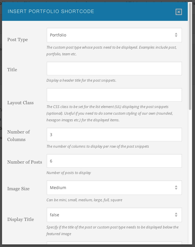
Portfolio Shortcodes
Post Snippets Shortcode -
See http://portfoliotheme.org/invent/portfolio-shortcodes/ for examples.
Displays the post snippets of blog posts or another custom post types with featured images. The post snippets are displayed in a grid fashion like a typical portfolio page or grid based blog page.
The number_of_columns parameter helps decide on the number of columns of posts/custom post types to display for each row displayed. Total number of posts displayed is derived from post_count parameter value.
This shortcode is quite powerful when used with custom post types and with filters based on custom taxonomy/terms specified as arguments.
Usage:
[show_post_snippets layout_class="rounded-images" post_type="portfolio" number_of_columns=3 post_count=6 image_size='medium' excerpt_count=100 display_title="true" display_summary="true" show_excerpt="true" hide_thumbnail="false"]
With taxonomy and terms specified, the portfolio items can be drawn from a specific portfolio category as shown below.
[show_post_snippets number_of_columns=3 post_count=6 image_size='large' terms="inspiration,technology" taxonomy="portfolio_category" post_type="portfolio"]
Examples:
A blog list.
[show_post_snippets id="blog-list" post_type="post" post_count=6 image_size='medium' excerpt_count=85 display_title=true show_meta=true display_summary=true show_excerpt="true" hide_thumbnail="false"]
A news list.
[show_post_snippets id="course-items" post_type="news" post_count=8 image_size='medium' excerpt_count=100 display_title=true show_meta=true display_summary=true show_excerpt="true" hide_thumbnail="false"]
A course list list.
[show_post_snippets id="course-items" post_type="course" post_count=8 image_size='medium' excerpt_count=100 display_title=true show_meta=true display_summary=true show_excerpt="true" hide_thumbnail="false"]
A staff members list.
[show_post_snippets id="staff-members" post_type="staff" post_count=8 image_size='medium' excerpt_count=100 display_title=true show_meta=true display_summary=true show_excerpt="true" hide_thumbnail="false"]
A department list.
[show_post_snippets id="departments-list" post_type="department" post_count=8 image_size='medium' excerpt_count=100 display_title=true show_meta=true display_summary=true show_excerpt="true" hide_thumbnail="false"]
A LearnDash courses list.
[show_post_snippets id="learndash-courses" post_type="sfwd-courses" post_count=8 image_size='medium' excerpt_count=100 display_title=true show_meta=true display_summary=true show_excerpt="true" hide_thumbnail="false"]
A portfolio items list.
[show_post_snippets id="portfolio-list" post_type="portfolio" post_count=6 image_size='medium' excerpt_count=100 display_title=false show_meta=false display_summary=false show_excerpt="true" hide_thumbnail="false"]
A gallery items list.
[show_post_snippets id="gallery-list" post_type="gallery_item" post_count=6 image_size='medium' excerpt_count=100 display_title=false show_meta=false display_summary=false show_excerpt="true" hide_thumbnail="false"]
Filtering Items:
Can use post_ids attribute to filter the items displayed. This helps you to display the specific courses/news/department/posts etc. on a page based on the post id of the course.
[show_post_snippets id="handpicked-courses" post_type="course" post_ids="543,544,567,523" post_count=6 image_size='medium' excerpt_count=85 display_title=true show_meta=true display_summary=true show_excerpt="true" hide_thumbnail="false"]
[show_post_snippets id="staff-members" post_type="staff" post_ids="124,125,126" post_count=8 image_size='medium' excerpt_count=100 display_title=true show_meta=true display_summary=true show_excerpt="true" hide_thumbnail="false"]
Can use taxonomy and terms arguments to filter the items displayed. This helps you to display the specific courses/news/posts etc. on a page belonging to a certain category/taxonomy of the course.
[show_post_snippets id="featured-courses" post_type="course" taxonomy="course_category" terms="chemistry,economics" post_count=6 image_size='medium' excerpt_count=85 display_title=true show_meta=true display_summary=true show_excerpt="true" hide_thumbnail="false"]
[show_post_snippets id="featured-posts" post_type="post" taxonomy="category" terms="inspiration,technology" post_count=6 image_size='medium' excerpt_count=85 display_title=true show_meta=true display_summary=true show_excerpt="true" hide_thumbnail="false"]
Parameters -
post_type - (string) The custom post type whose posts need to be displayed. Examples include post, portfolio, course, news, department, staff, sfwd-courses (LearnDash course), gallery_item etc.
post_count - 4 (number) - Number of posts to display
image_size - medium (string) - Can be mini, small, medium, large, full, square.
title - (string) Display a header title for the post snippets.
layout_class - (string) The CSS class to be set for the list element (UL) displaying the post snippets. Useful if you need to do some custom styling of our own (rounded, hexagon images etc.) for the displayed items.
number_of_columns - 4 (number) - The number of columns to display per row of the post snippets
display_title - true (boolean) - Specify if the title of the post or custom post type needs to be displayed below the featured image
display_summary - true (boolean) - Specify if the excerpt or summary content of the post/custom post type needs to be displayed below the featured image thumbnail.
show_excerpt - true (boolean) - Display excerpt for the post/custom post type. Has no effect if display_summary is set to false. If show_excerpt is set to false and display_summary is set to true, the content of the post is displayed truncated by the WordPress tag. If more tag is not specified, the entire post content is displayed.
excerpt_count - 100 (number) - Applicable only to excerpts. The excerpt displayed is truncated to the number of characters specified with this parameter.
hide_thumbnail false (boolean) - Display thumbnail image or hide the same.
show_meta - true (boolean) Display meta information like the author, date of publishing and number of comments.
excerpt_count - 100 (number) The total number of characters of excerpt to display.
taxonomy - (string) Custom taxonomy to be used for filtering the posts/custom post types displayed.
terms - (string) The terms of taxonomy specified.
no_margin - false (boolean) - If set to true, no margins are maintained between the columns. Helps to achieve the popular packed layout.
Show Portfolio shortcode -
Helps to display a portfolio page style display of portfolio items with JS powered portfolio category filter. Packed layout option is also available.
Usage:
[show_portfolio number_of_columns=4 post_count=12 image_size='small' filterable=true no_margin=true]
Parameters -
post_count - 9 (number) - Total number of portfolio items to display
number_of_columns - 3 (number) - The number of columns to display per row of the portfolio items
image_size - medium (string) - Can be mini, small, medium, large, full, square.
filterable - true (boolean) The portfolio items will be filterable based on portfolio categories if set to true.
no_margin - false (boolean) If set to true, no margins are maintained between the columns. Helps to achieve the popular packed layout.
Show Gallery shortcode -
Helps to display a gallery page style display of gallery items with JS powered gallery category filter. Packed layout option is also available.
Usage:
[show_gallery number_of_columns=4 post_count=12 image_size='small' filterable=true no_margin=false]
Parameters -
post_count - 9 (number) - Number of gallery items to display
number_of_columns - 4 (number) - The number of columns to display per row of the gallery items
image_size - medium (string) - Can be mini, small, medium, large, full, square.
filterable - true (boolean) The gallery items will be filterable based on gallery categories if set to true.
no_margin - false (boolean) If set to true, no margins are maintained between the columns. Helps to achieve the popular packed layout.
Slider Shortcodes
Responsive Slider Shortcode -
Use this shortcode to create a slider out of any HTML content. All it requires a UL element with children to show.
Usage:
[responsive_slider type="testimonials2" animation="slide" control_nav="true" direction_nav=false pause_on_hover="true" slideshow_speed=4500]
<ul>
<li>Slide 1 content goes here.</li>
<li>Slide 2 content goes here.</li>
<li>Slide 3 content goes here.</li>
</ul>
[/responsive_slider]
Parameters -
type (string) - Constructs and sets a unique CSS class for the slider. (optional).
slideshow_speed - 5000 (number). Set the speed of the slideshow cycling, in milliseconds
animation_speed - 600 (number). Set the speed of animations, in milliseconds.
animation - fade (string). Select your animation type, "fade" or "slide".
pause_on_action - true (boolean). Pause the slideshow when interacting with control elements, highly recommended.
pause_on_hover - true (boolean). Pause the slideshow when hovering over slider, then resume when no longer hovering.
direction_nav - true (boolean). Create navigation for previous/next navigation? (true/false)
control_nav - true (boolean). Create navigation for paging control of each slide? Note: Leave true for manual_controls usage.
easing - swing (string). Determines the easing method used in jQuery transitions. jQuery easing plugin is supported!
loop - true (boolean). Should the animation loop?
slideshow - true (boolean). Animate slider automatically without user intervention.
controls_container - (string). Selector: USE CLASS SELECTOR. Declare which container the navigation elements should be appended too. Default container is the FlexSlider element. Example use would be ".flexslider-container". Property is ignored if given element is not found.
manualControls - (string). Selector: Declare custom control navigation. Examples would be ".flex-control-nav li" or "#tabs-nav li img", etc. The number of elements in your controlNav should match the number of slides/tabs.
style - (string) - The inline CSS applied to the slider container DIV element.
Tab Slider Shortcode -
Use this shortcode to create a smooth tab slider out of any HTML content. All it requires a UL element with children to show the tabs.
The tab names are provided by the LI elements with data-name attribute set as shown below.
Usage:
[tab_slider slideshow=false animation=slide direction_nav=false]
<ul>
<li data-name="Slide 1">Slide 1 content goes here.</li>
<li data-name="Slide 2">Slide 2 content goes here.</li>
<li data-name="Slide 3">Slide 3 content goes here.</li>
</ul>
[/tab_slider]
Parameters -
type (string) - Constructs and sets a unique CSS class for the slider. (optional).
slideshow - false (boolean). Animate slider automatically without user intervention. The slideshow is not enabled by default since the user is expected to navigate manually using the tabs.
slideshow_speed - 5000 (number). Set the speed of the slideshow cycling, in milliseconds. Takes effect only if slideshow is set to true.
animation_speed - 600 (number). Set the speed of animations, in milliseconds.
animation - slide (string). Select your animation type, "fade" or "slide".
easing - swing (string). Determines the easing method used in jQuery transitions. jQuery easing plugin is supported!
loop - true (boolean). Should the animation loop? Takes effect only if slideshow is set to true.
style - (string) - The inline CSS applied to the slider container DIV element.
Responsive Carousel Shortcode -
Use this shortcode to create a carousel out of any HTML content. All it requires is a set of DIV elements to show. Each of the DIV element is an item in the carousel.
Usage:
[responsive_carousel id="stats-carousel" navigation="false" pagination="true" items=3 items_tablet=2 items_tablet_small=1 items_desktop_small=3 items_desktop=3]
[wrap]Slide 1 content goes here.[/wrap]
[wrap]Slide 2 content goes here.[/wrap]
[wrap]Slide 3 content goes here.[/wrap]
[/responsive_carousel]
Parameters -
id (string) - The element id to be set for the wrapper element created. (optional).
pagination_speed - 800 (number). Pagination speed in milliseconds
slide_speed - 200 (number). Slide speed in milliseconds.
rewind_speed - 1000 (number). Rewind speed in milliseconds.
stop_on_hover - true (boolean). Stop autoplay on mouse hover.
auto_play - false (boolean/number). Change to any integer for example autoPlay : 5000 to play every 5 seconds. If you set autoPlay: true default speed will be 5 seconds.
scroll_per_page - false (boolean). Scroll per page not per item. This affect next/prev buttons and mouse/touch dragging.
navigation - false (boolean). Display "next" and "prev" buttons.
pagination - true (boolean). Show pagination.
items - 5 (number) - This variable allows you to set the maximum amount of items displayed at a time with the widest browser width.
items_desktop - (number) This variable allows you to set the maximum amount of items displayed at a time with the desktop browser width (<1200px).
items_desktop_small - (number) - This variable allows you to set the maximum amount of items displayed at a time with the smaller desktop browser width(<980px).
items_tablet - (number) - This variable allows you to set the maximum amount of items displayed at a time with the tablet browser width(<769px).
items_tablet_small - (number) - This variable allows you to set the maximum amount of items displayed at a time with the smaller tablet browser width.
items_mobile - (number) - This variable allows you to set the maximum amount of items displayed at a time with the smartphone mobile browser width(<480px).
layout_class - (string) The CSS class to be set for the wrapper div for the carousel. Useful if you need to do some custom styling of our own (rounded, hexagon images etc.) for the displayed items.
Post Snippets Carousel Shortcode -
Use this shortcode to create a carousel of posts or any custom post type like courses, staff, department, portfolio, gallery, posts etc.
Usage:
A blog carousel.
[post_snippets_carousel id="blog-carousel" post_type="post" navigation="true" items=3 post_count=6 image_size='medium' excerpt_count=85 display_title=true show_meta=true display_summary=true show_excerpt="true" hide_thumbnail="false" navigation="true"]
A news carousel.
[post_snippets_carousel id="course-items" post_type="news" navigation="true" items=4 post_count=8 image_size='medium' excerpt_count=100 display_title=true show_meta=true display_summary=true show_excerpt="true" hide_thumbnail="false" navigation="true"]
A course list carousel.
[post_snippets_carousel id="course-items" post_type="course" navigation="true" items=4 post_count=8 image_size='medium' excerpt_count=100 display_title=true show_meta=true display_summary=true show_excerpt="true" hide_thumbnail="false" navigation="true"]
A staff members carousel.
[post_snippets_carousel id="staff-members" post_type="staff" navigation="true" items=4 post_count=8 image_size='medium' excerpt_count=100 display_title=true show_meta=true display_summary=true show_excerpt="true" hide_thumbnail="false" navigation="true"]
A department carousel.
[post_snippets_carousel id="departments-list" post_type="department" navigation="true" items=4 post_count=8 image_size='medium' excerpt_count=100 display_title=true show_meta=true display_summary=true show_excerpt="true" hide_thumbnail="false" navigation="true"]
A LearnDash courses carousel.
[post_snippets_carousel id="learndash-courses" post_type="sfwd-courses" navigation="true" items=4 post_count=8 image_size='medium' excerpt_count=100 display_title=true show_meta=true display_summary=true show_excerpt="true" hide_thumbnail="false" navigation="true"]
A portfolio items carousel.
[post_snippets_carousel id="portfolio-carousel" post_type="portfolio" navigation="true" items=3 post_count=6 image_size='medium' excerpt_count=100 display_title=false show_meta=false display_summary=false show_excerpt="true" hide_thumbnail="false" navigation="true"]
A gallery items carousel.
[post_snippets_carousel id="gallery-carousel" post_type="gallery_item" navigation="true" items=3 post_count=6 image_size='medium' excerpt_count=100 display_title=false show_meta=false display_summary=false show_excerpt="true" hide_thumbnail="false" navigation="true"]
Filtering Items:
Can use post_ids attribute to filter the items displayed. This helps you to display the specific courses/news/department/posts etc. on a page based on the post id of the course.
[post_snippets_carousel id="handpicked-courses" post_type="course" post_ids="543,544,567,523" navigation="true" items=3 post_count=6 image_size='medium' excerpt_count=85 display_title=true show_meta=true display_summary=true show_excerpt="true" hide_thumbnail="false" navigation="true"]
[post_snippets_carousel id="staff-members" post_type="staff" post_ids="124,125,126" navigation="true" items=4 post_count=8 image_size='medium' excerpt_count=100 display_title=true show_meta=true display_summary=true show_excerpt="true" hide_thumbnail="false" navigation="true"]
Can use taxonomy and terms arguments to filter the items displayed. This helps you to display the specific courses/news/posts etc. on a page belonging to a certain category/taxonomy of the course.
[post_snippets_carousel id="featured-courses" post_type="course" taxonomy="course_category" terms="chemistry,economics" navigation="true" items=3 post_count=6 image_size='medium' excerpt_count=85 display_title=true show_meta=true display_summary=true show_excerpt="true" hide_thumbnail="false" navigation="true"]
[post_snippets_carousel id="featured-posts" post_type="post" taxonomy="category" terms="inspiration,technology" navigation="true" items=3 post_count=6 image_size='medium' excerpt_count=85 display_title=true show_meta=true display_summary=true show_excerpt="true" hide_thumbnail="false" navigation="true"]
Parameters -
id (string) - The element id to be set for the wrapper element created. (optional).
pagination_speed - 800 (number). Pagination speed in milliseconds
slide_speed - 200 (number). Slide speed in milliseconds.
rewind_speed - 1000 (number). Rewind speed in milliseconds.
stop_on_hover - true (boolean). Stop autoplay on mouse hover.
auto_play - false (boolean/number). Change to any integer for example autoPlay : 5000 to play every 5 seconds. If you set autoPlay: true default speed will be 5 seconds.
scroll_per_page - false (boolean). Scroll per page not per item. This affect next/prev buttons and mouse/touch dragging.
navigation - false (boolean). Display "next" and "prev" buttons.
pagination - false (boolean). Show pagination.
items - 5 (number) - This variable allows you to set the maximum amount of items displayed at a time with the widest browser width.
items_desktop - (number) This variable allows you to set the maximum amount of items displayed at a time with the desktop browser width (<1200px).
items_desktop_small - (number) - This variable allows you to set the maximum amount of items displayed at a time with the smaller desktop browser width(<980px).
items_tablet - (number) - This variable allows you to set the maximum amount of items displayed at a time with the tablet browser width(<769px).
items_tablet_small - (number) - This variable allows you to set the maximum amount of items displayed at a time with the smaller tablet browser width.
items_mobile - (number) - This variable allows you to set the maximum amount of items displayed at a time with the smartphone mobile browser width(<480px).
post_type - (string) The custom post type whose posts need to be displayed. Can be post, gallery_item, portfolio, course, staff, department, news, sfwd-courses (LearnDash course) etc.
post_count - 4 (number) - Number of posts to display
post_ids - A comma separated post ids of the custom post types. Helps to filter the post types for display (optional)
image_size - medium (string) - Can be mini, small, medium, large, full, square.
layout_class - (string) The CSS class to be set for the wrapper div for the carousel. Useful if you need to do some custom styling of our own (rounded, hexagon images etc.) for the displayed items.
display_title - true (boolean) - Specify if the title of the post or custom post type needs to be displayed below the featured image
display_summary - true (boolean) - Specify if the excerpt or summary content of the post/custom post type needs to be displayed below the featured image thumbnail.
show_excerpt - true (boolean) - Display excerpt for the post/custom post type. Has no effect if display_summary is set to false. If show_excerpt is set to false and display_summary is set to true, the content of the post is displayed truncated by the WordPress tag. If more tag is not specified, the entire post content is displayed.
excerpt_count - 100 (number) - Applicable only to excerpts. The excerpt displayed is truncated to the number of characters specified with this parameter.
hide_thumbnail false (boolean) - Display thumbnail image or hide the same.
show_meta - true (boolean) Display meta information like the author, date of publishing and number of comments.
excerpt_count - 100 (number) The total number of characters of excerpt to display.
taxonomy - (string) Custom taxonomy to be used for filtering the posts/custom post types displayed.
terms - (string) The terms of taxonomy specified.
no_margin - false (boolean) - If set to true, no margins are maintained between the columns. Helps to achieve the popular packed layout.
Contact Form Shortcode
To add a contact form to your website, first create a blank page and then use Shortcode Builder to add Contact Form shortcode listed under Social Shortcodes. Also see our live preview page for Contact Form shortcode
Usage:
[contact_form mail_to="receipient@mydomain.com" phone=true web_url=true subject=true button_color="default"]
Enter in the email address to which you want the email to be received. Once the theme is setup, test out the Contact Form functionality. The Contact Form function utilizes wp_mail function to send emails. If emails are not being received, please make sure the contact email entered is the right one and then check with your hosting provider to make sure SMTP and smtp_port have been setup right on your server. Or you can install a Plugin like the Configure SMTP plugin for Wordpress to configure SMTP.
Parameters -
class - Custom CSS class name to be set for the div element created (optional)
mail_to - A string field specifying the recipient email where all form submissions will be received.
web_url - Can be true or false. A boolean indicating that the user should be requested for Web URL via an input field.
phone - Can be true or false. Request for phone number of the user. A phone number field is displayed.
subject - Can be true or false. A mail subject field is displayed if the value is set to true.
button_color - Color of the submit button. Available colors are black, blue, cyan, green, orange, pink, red, teal, theme and trans.
Social List Shortcode -
Displays a list of social icons with links to various social network pages.
Usage:
[social_list googleplus_url="http://plus.google.com" facebook_url="http://www.facebook.com" twitter_url="http://www.twitter.com" youtube_url="http://www.youtube.com/" linkedin_url="http://www.linkedin.com" include_rss="true"]
Parameters -
email - The email address to be used.
facebook_url - The URL of the Facebook page.
twitter_url - The URL of the Twitter account.
flickr_url - The URL of the Flickr page.
youtube_url - The URL for the YoutTube channel.
linkedin_url - The URL for the LinkedIn profile.
googleplus_url - The URL for the Google Plus page.
vimeo_url - The URL for the Vimeo channel.
instagram_url - The URL to your Instagram account.
behance_url - The URL of the Behance page.
pinterest_url - The URL for the Pinterest account.
skype_url - The URL for the Skype id.
dribbble_url - The URL of the Dribbble page.
include_rss - A boolean value(true/false string) indicating that the link to the RSS feed be included. Default is false.
align - Can be left, right, center or none. The default is left. (optional).
Paypal Donate Shortcode -
Lets you display a Paypal donate button wherever you need - inside a post or a page.
Usage:
[donate title="Please Donate to John Smith Foundation" account="email@example.com" display_card_logos="true" cause="Earthquake Relief"]
Parameters -
title - The title of the link that displays the Paypal donate button.
account - The Paypal account for which the donate button is being created.
display_card_logos - A boolean value to specify display of the logo images of the credit cards accepted for Paypal donations
cause - The text indicating the purpose for which the donation is being collected.
Subscribe RSS Shortcode -
Displays a box that lets users invite users to subscribe to the RSS feed for the blog.
Usage:
[subscribe_rss]
Parameters -
None
Tabs Shortcodes
Tab Group Shortcode -
Creates a list of tabs by converting a group of shortcodes indicating tab title and tab content.
Each tab is displayed with a title and content.
Usage:
[tabgroup]
[tab title="Tab 1"]Tab 1 content goes here.[/tab]
[tab title="Tab 2"]Tab 2 content goes here.[/tab]
[tab title="Tab 3"]Tab 3 content goes here.[/tab]
[/tabgroup]
Parameters -
title - The title of the tab. The content of the tab is derived from content wrapped by the shortcode.
Toggle Shortcode -
Displays a toggle box with content hidden. The content is shown when the toggle is clicked.
Usage:
[toggle class="first" title="Toggle 1"]Toggle 1 content goes here.[/toggle]
[toggle title="Toggle 2"]Toggle 2 content goes here.[/toggle]
[toggle title="Toggle 3"]Toggle 3 content goes here.[/toggle]
Parameters -
class - CSS class name to be assigned to the toggle DIV element created.
title - The title of the toggle.
Stats Shortcodes
Stats Shortcode -
The [stats] wraps an animated percentage stats list. Displays an animated percentage stats bar comprising of [stats_bar] shortcodes. The bar animates to indicate the percentage.
Usage:
[stats]
[stats_bar title="Web Design 87%" value="87"]
[stats_bar title="Logo Design 60%" value="60"]
[stats_bar title="Brand Marketing 70%" value="70"]
[/stats_bar][stats_bar title="SEO Services 67%" value="67"]
[stats_bar title="Print Collateral 40%" value="40"]
[/stats]
Parameters -
title - The title indicating the stats bar title.
value - The percentage value for the percentage stats to be displayed.
Number Stats shortcode -
The [number-stat] indicates a statistic whose content is a number or statistics.
Usage:
[number-stat icon="icon-study" title="Graduate in 4 years" text="Double the National Average"]80%[/number-stat]
[number-stat icon="icon-shop" title="Student to Faculty Ratio"]13:1[/number-stat]
[number-stat icon="icon-world" title="Volunteered for community service"]84%[/number-stat]
[number-stat icon="icon-paperplane" title="Female to Male Ratio"]55:45[/number-stat]
Parameters -
title - The title indicating the stats title.
text - Any additional text shown below the title.
icon - The font icon to be displayed for the statistic being displayed, chosen from the list of icons listed at http://support.portfoliotheme.org/faqs/how-to-use-1500-icons-bundled-with-the-agile-theme/
Piechart Shortcode -
Displays a piechart for a percentage statistic with a title in the middle of the piechart displayed.
While the piechart animates to indicate the percentage specified, a textual representation of the statistic is also displayed in the center of the piechart.
Usage:
[piechart percent=70 title="Repeat Customers"]
[piechart percent=92 title="Referral Work"]
Parameters -
title - The title indicating the stats title.
value - The percentage value for the percentage stats.
Miscellenous Shortcodes
Box Shortcodes -
Usage:
[success title = 'Congrats!']Your success message[/success]
[success]Your success message without title[/success]
[info]Your info message without title[/info]
[attention]An attention message without title[/attention]
[warning]Your warning message without title[/warning]
[tip]Your tip message without title[/tip]
[info]Your info message without title[/info]
Parameters -
style - Inline CSS styling (optional)
title - Title displayed above the text in bold.
Box Frame Shortcode -
Usage:
[box_frame style="background: #FFF;" width="275px" class="pricing-box" align="center" title="Pet Care" inner_style="padding:20px;"]
Any HTML content goes here - images, lists, text paragraphs, even sliders.
[/box_frame]
Parameters -
style - Inline CSS styling (optional)
class - Class name to be assigned for the box div element. Useful for custom styling.
align - Can be aligned left, right or centered.
title - Title for the box in bold.
width - Custom width of the box. Include px suffix.
inner_style - Inline CSS styling for the inner box (optional)
Divider Shortcodes -
Draws a line or a divider of various kinds depending on the shortcode used.
Usage:
[divider]
[divider_line]
[divider_space]
[divider_fancy]
Parameters -
id - The element id to be set for the div element created (optional).
style - Inline CSS styling applied for the div element created (optional)
class - Custom CSS class name to be set for the div element created (optional)
Divider Top Shortcode -
Draws a line or a divider with a Back to Top link on the right. The user is smooth scrolled to the top of the page upon clicking the Back to Top link.
Usage:
[divider_top]
Parameters -
None
Clear Shortcode -
Create a DIV element aimed at clearing the layout. Useful to avoid elements wrapping around when using floats.
Usage:
[clear]
Parameters -
None
Header Fancy Shortcode -
Draws a nice looking header with a title displayed in the center and with a line dividing the content.
Usage:
[header_fancy class="header1" style="margin-bottom: 20px;" title="Smartphone Section"]
Parameters -
class - The CSS class to be set for the div element created (optional).
style - Inline CSS styling applied for the div element created (optional)
title - The title to be displayed in the center of the header.
Custom Widgets and Sidebars
- Flickr: Displays thumbnails from the Flickr ID specified.
- Social Icon: Displays the social media icons .
- Contact Form: Displays a contact form.
- Contact Info: Displays a contact information.
- Popular Posts: Displays the popular posts on your site.
- Recent Posts: Displays the popular posts on your site.
Simply drag one of your theme's custom widgets to a sidebar and enter the appropriate settings if needed. Invent also has several sidebars as shown in the image below.
Twitter Widget: To display tweets, the theme recommends you install the 'Recent Tweets Widget' plugin or use the default widget provided by Twitter itself. Detailed instructions on how to use this widget is here
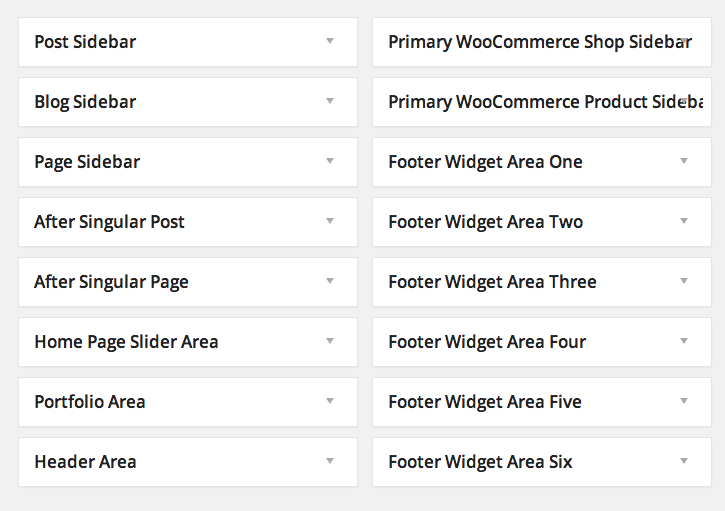
Template Pages
Invent comes with nearly a dozen WordPress template pages that you can select when you edit/publish a page from the “Edit Page” “Attributes” settings box as seen below:
- One Column No Sidebars: Displays content content constrained to 1140px content grid by default. A page created with this template does not span across the entire browser window width (unlike the Full Width template) and hence does not require you to use [segment] shortcode to constrain content to a 1140px grid. Displays no sidebars.
- Left Sidebar: Displays the theme's sidebar on the left side of the page.
- Right Sidebar/Default: Displays the theme's sidebar on the right side of the page - the default layout for a page/post.
- Portfolio: Displays the portfolio items in the a 3 column grid. You can control the number of columns and post counts in the Portfolio Page tab of the theme options panel.
- Gallery: Displays the gallery items in the a 3 column grid. You can control the number of columns and post counts in the Gallery Page tab of the theme options panel.
- Filtered Portfolio: Displays the portfolio items in the a 3 column grid with the ability to filter the portfolio items by category. You can control number of columns and post counts in the Portfolio Page tab of the theme options panel.
- Filtered Gallery: Displays the gallery items in the a 3 column grid with the ability to filter the gallery items by category. You can control the number of columns and post counts in the Gallery Page tab of the theme options panel.
- Faculty and Staff, News, Testimonials, Courses, Departments: These page templates help display their respective custom post types in a grid fashion.
- Blog: Displays the blog posts on the page. The nature of display- full width, grid, thumbnail etc. can be configured through the options panel as depicted under layout management
- Composite Page: (deprecated)Template for one page sites. Composed of several instances of page section custom post type as explained in the Installation section above. Displays content across full width of the browser window unless you specify the [segment] shortcode (see documentation of the shortcode under shortcodes section) to constrain the content to 1140px centered grid. Displays no sidebars.
- Full Width: (deprecated) Displays content across full width of the browser window unless you specify the [segment] shortcode to constrain the content to 1140px centered grid. Displays no sidebars.
Translate
You can learn from here about translating your site into your language. Use the invent.pot in 'invent/languages' folder as a template to create .po files. Poedit is the popular free editor for creating .po and the corresponding binary .mo files. Do reach out to us in case you find something that is not translation ready.
500+ Icons and Icon Fonts usage
The list of icons bundled with the theme is listed here - Font Icons bundled with Invent To use the icons, you can use the [icon] shortcode explained in Typography Shortcodes section or you just insert a markup like
<span class="icon-pencil"></span>or some prefer
<i class="icon-pencil"></i>to display the icon.
The link provides you with the class names to use to display the corresponding icon. These font icons can be styled in CSS for color and size. You can utilize the custom.css file or the Custom CSS tab in the options panel to insert styling information like this -
#my-section i { font-size: 32px; color: #333; }.
Do look for some examples of the usage in the demo content provided with the theme.
Although I am not going to recommend it due to repetition and reloads, theoretically you can use inline styling as well to scale the icon and color it like this -
<i class="icon-switch" style="color:blue; font-size:48px;"></i>.
If you cannot insert HTML markup into your content as explained above, you may want to look at the option of using icon sprites or icon images bundled with the theme in the folder [theme directory]/images/icons/icomoon/. The sprites folder has information on icons available in the sprite and the [theme directory]/images/icons/icomoon/sprites.css file has required markup to use these sprites.
Unlimited Sidebars
The creation of unlimited custom sidebars is depicted below. Essentially, the custom sidebars are created in the 'Sidebar' options tab in options panel and the user gets to choose the required sidebar in the post/page edit window.

The custom sidebars defined will appear in the widgets WP admin page. Drag and drop the required widgets into the sidebars

In the page/post edit window, choose the custom sidebar of your choice or leave default as the choice to help theme defined widgets panels to take effect.

Custom Backgrounds for pages/posts/portfolio
To set custom background for pages/posts/portfolio items, navigate to Theme Options->Backgrounds tab and change the options for 'Background for Title Header Area' and 'Background for Portfolio Title Area' as seen the screenshot below. You can adjust the height of the background as well using the available options 'Height of Top Title Area' and 'Height of Top Portfolio Title Header Area'.
To change the backgrounds for header of a specific page/post/portfolio item, the "Heading Options" provided in the Page/Post/Portfolio edit window can be set as seen below
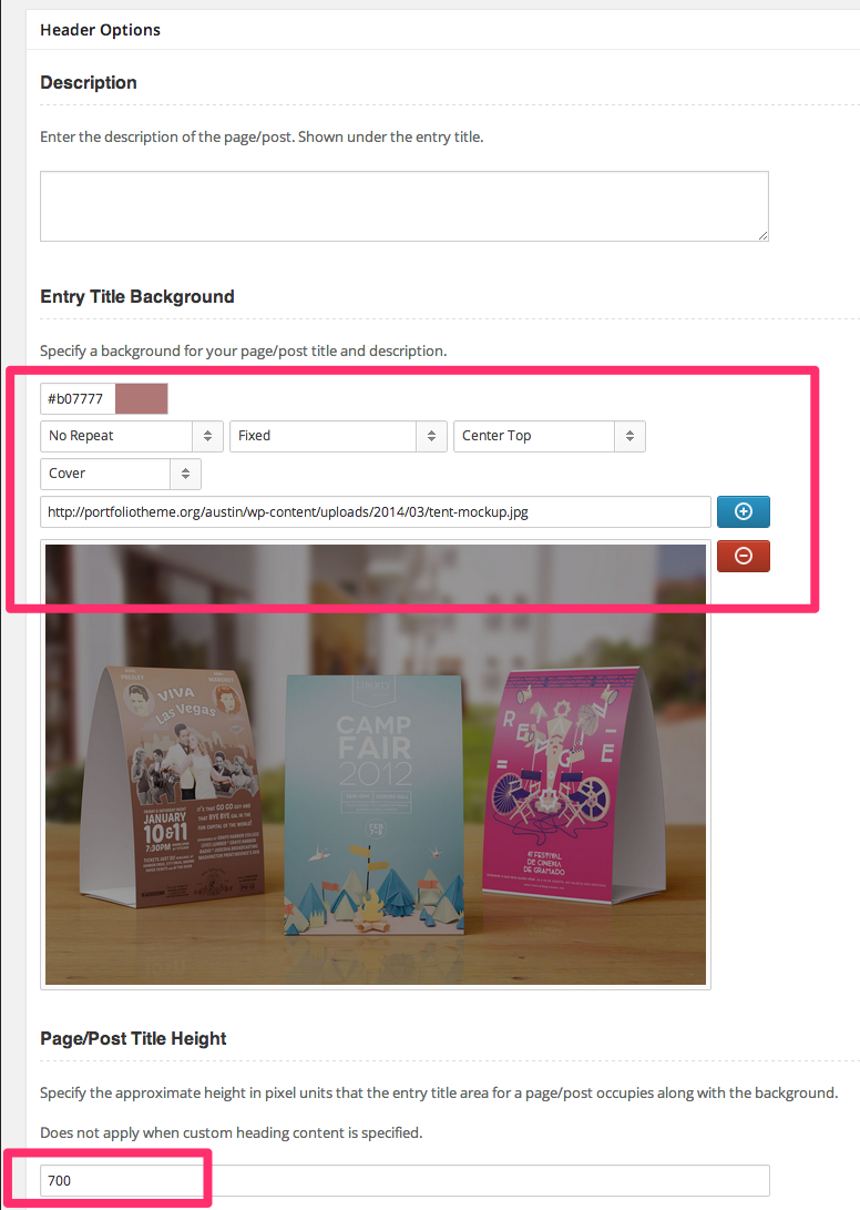
Custom Titles and Headers for pages/posts
Invent offers unlimited flexibility in creating a custom header for a page/post/portfolio item. The above the fold content for any page/post can be configured through custom content by specifying the required HTML markup and/or backgrounds through the input boxes provided in the page/post edit window in the WordPress admin panel as shown below. You may use [segment] shortcode to constrain the headings to a 1140px centered grid.
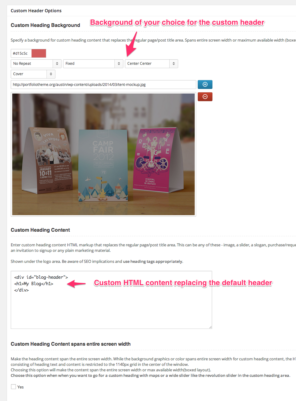
LearnDash Learning Management System
Invent has been tested to be compatible with LearnDash - one of the most versatile LMS plugins. To know more about LearnDash, visit http://www.learndash.com/.
LearnDash needs to be purchased separately. Support and Documentation for LearnDash is provided at LearnDash Support Site
LearnDash is installed like any other WordPress plugin and comes with a rich set of tools for setting up an full-featured LMS on your site. The theme helps provide custom styling, custom sidebars and a page template to help make the integration with LearnDash seamless.
Invent comes with two custom widgets areas for LearnDash -.
LearnDash Course List Sidebar - Sidebar displayed in pages displaying list of LearnDash courses.
LearnDash Custom Post Sidebar - Sidebar displayed in pages displaying single LearnDash course, lesson, topic, assignment, quiz or certification etc.

Invent also has a custom page template for displaying list of Courses configured in LearnDash admin panel -.
LearnDash Courses - Helps create a page displaying list of LearnDash courses.
Legacy Page Sections
Invent prior to v3 was built on the concept of page sections to make building a site easier. Use of page sections is no longer recommended after we rolled out support for page builder in v3 of the theme. This section of documentation exists as a reference for users who are yet to migrate to page builder functions supported by the theme.
Page Sections can be used for composing single page or multiple page sites and require use of a Custom Post Type named page sections and a page template named 'Composite Page' that can aggregate these page sections and use them.
Step 1: Create Page Sections that help compose a page. Page section custom post type is meant for acting as individual units/sections that make up a typical one page site home page. Navigation menu on the top can house internal links to these page sections helping to navigate within the page.
Invent theme framework lets you create any number of page sections and you can actually compose multiple one page instances in your site by using these page sections.

Step 2: Once you have the page sections ready, add a new page with page template of type 'Composite Page'.
You then choose the Page sections that go into the single page by dragging the required sections from the "Available Page Sections" box to "Chosen Page Sections" box as seen in the Page Edit window below as seen in the screenshot below.
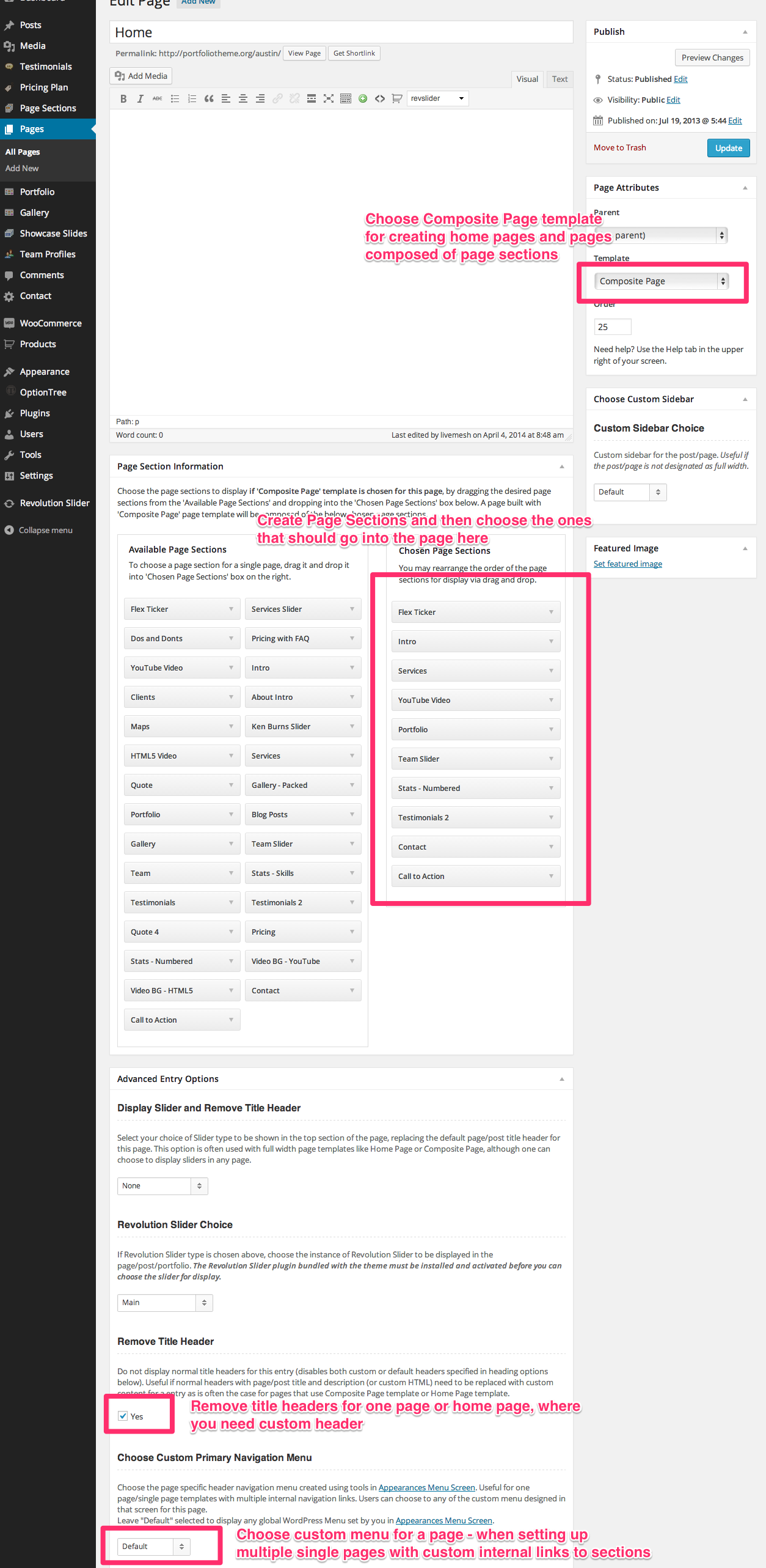
Again, thank you so much for purchasing our theme. We will be glad to help, resolve issues for you, answer your questions and plan to provide updates to you. Since Invent is built on common framework, we expect that any updates we do for any of our themes will be released as a framework update for all of our themes. For more general questions on WordPress or on ThemeForest themes, do visit the active forums maintained by them.
LiveMesh
Go To Top
Social Shortcodes